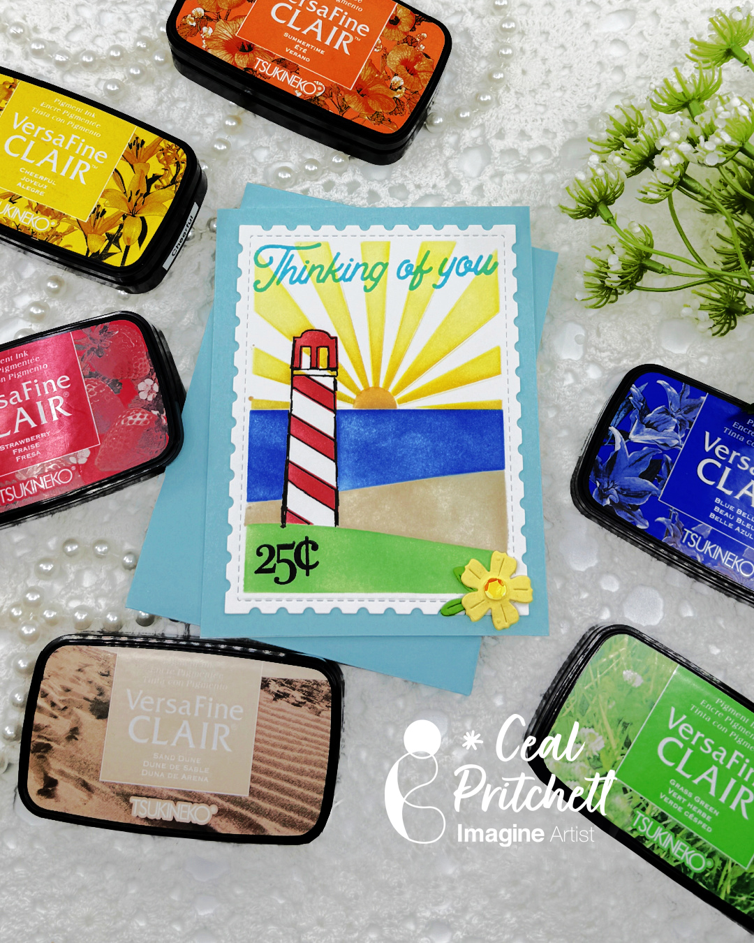
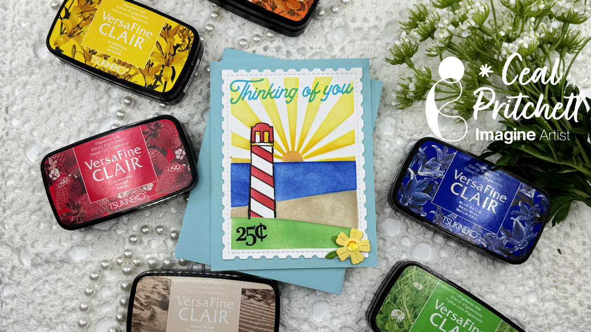
Hello crafty friends. It’s Ceal, here. Today I am sharing a beachy card using some summer colors. When I think beach, I think lighthouses because the beach we go to has one on it.
Skill level: Intermediate to advanced Time: An hour or more
Directions:
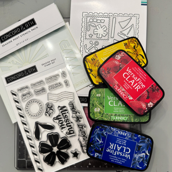
Gather your supplies. You will need a beach themed stamp, stencil and dies. Several colors of inks. Post-it notes or masking paper and a fine liner pen.
Step 1:
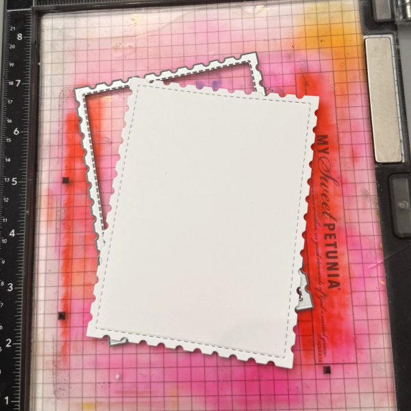
Die cut the postage stamp panel. This must be cut first with this particular set because you line up the stitched lines.
Step 2:
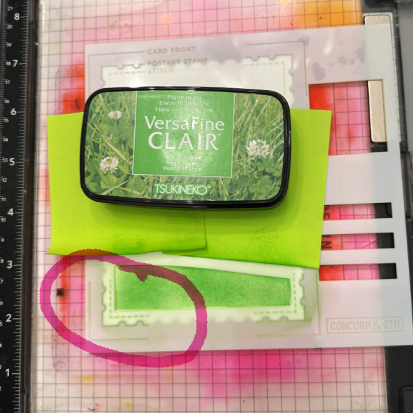
Place the stencil over the panel, lining up the stitched part, I circled it so you could see what I am referencing. Mask off other areas of the card so you don’t get ink on it. Ink blend green ink for the grass. Remove and clean the stencil
Step 3:
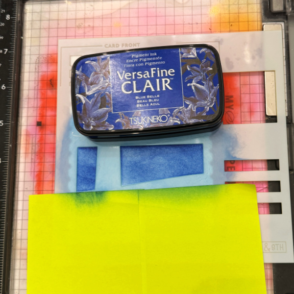
Mask off the grass and ink blend blue for the ocean. Remove and clean the stencil.
Step 4:
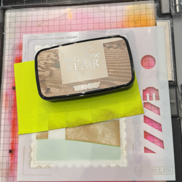
Mask off the ocean. Ink blend brown for the sand, remove and clean the stencil.
Step 5:
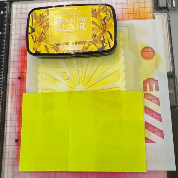
Mask off the bottom portion of the stencil. Ink blend Yellow for the sun rays. Remove and clean the stencil.
Step 6:
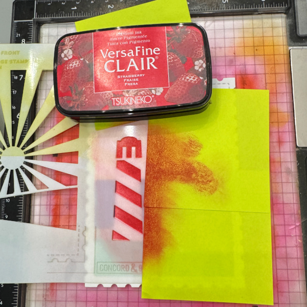
Ink blend red for the lighthouse. Remove and clean the stencil.
Step 7:
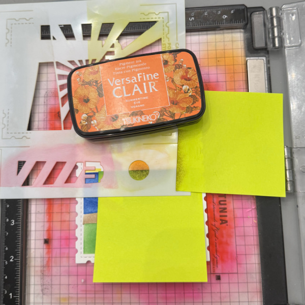
Be sure to mask off portions of the card that may get inky. Place the stencil down where the sun is in the white space that was left after blending the sunrays. Ink blend orange in the circle and also at the base of the sunrays. Remove and clean the stencil.
Step 8: (optional)
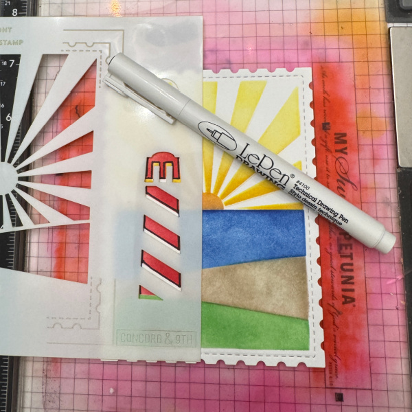
This step s totally optional but I like the way it grounds the lighthouse. Place stencil back over the lighthouse and use a fine liner pen to trace the stripes.
Step 9:
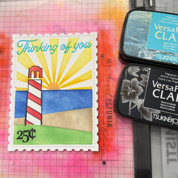
Stamp the greeting in blue and the 25 cents in black. Not pictured in this photo but you will need to die cut the flower and add it to the corner as shown in the finished card.
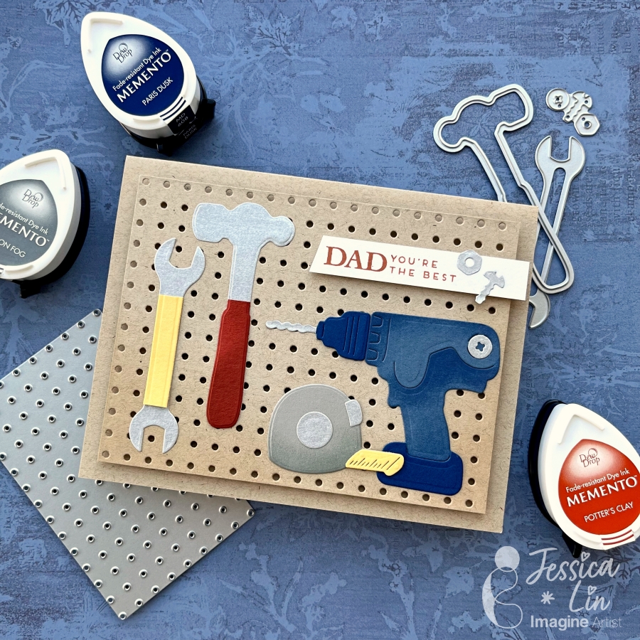
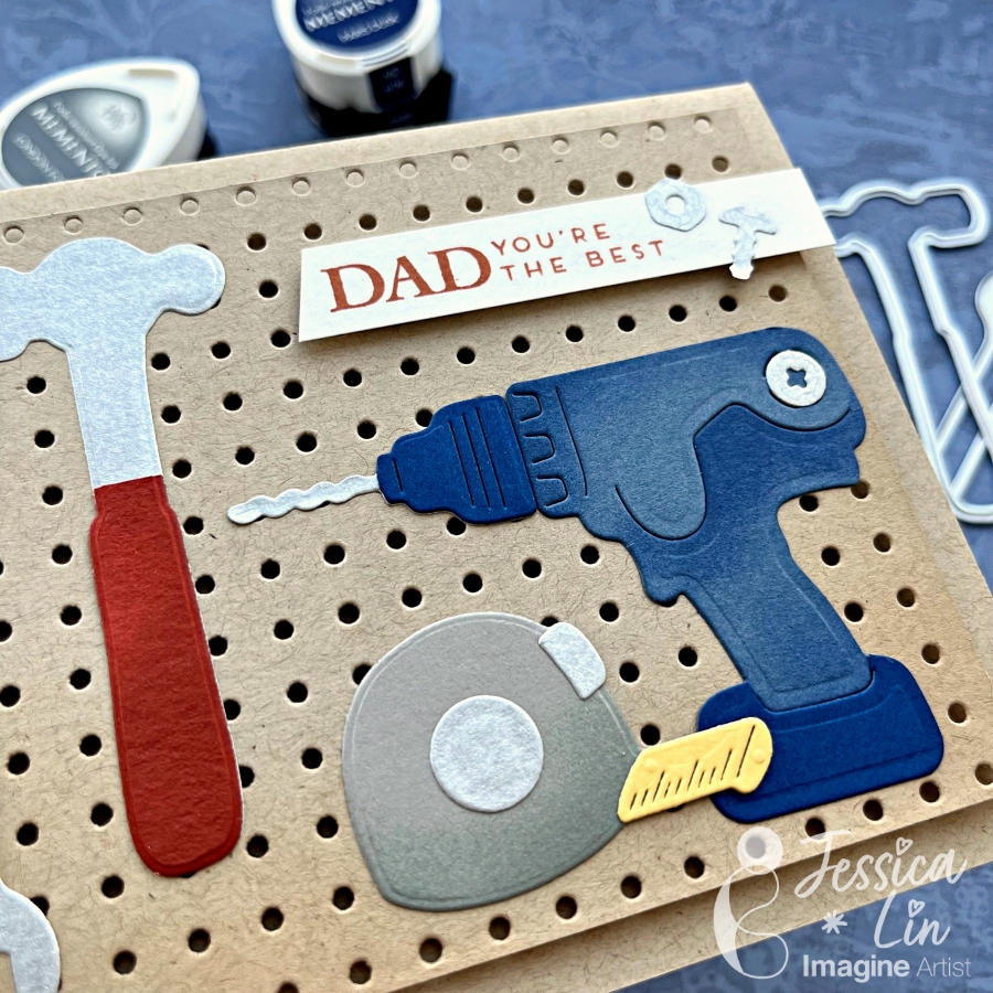
Hi everyone! It’s Jessica here. Today I would like to share a Father’s Day card that showcases different tools to thank my dad for all the home improvement projects he has done in the past year. I also ink blended Memento inks on the die cut pieces to create more depth. If you’d like to learn some tips and tricks on ink blending small paper elements, just keep reading!
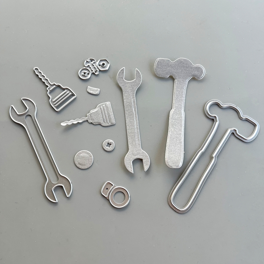
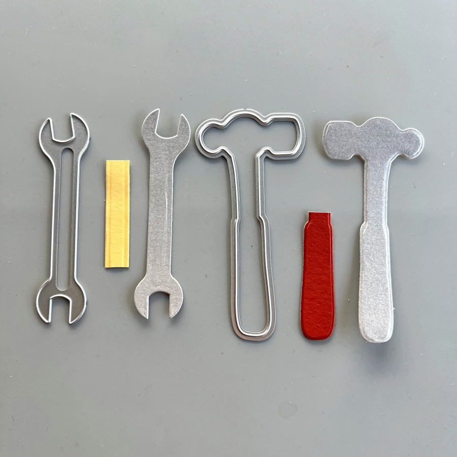
Step 1: First, I die cut several tools from a silver cardstock. I’ve had this paper for a long time since my scrapbooking days, and I am glad to finally use it again. I also adhered Stick It sheets to the back of the silver cardstock before die cutting, so that all of the elements are adhesive backed. This will make adhering to the small tool pieces easier and mess-free.
Step 2: Die cut again with colored cardstock to create the handles on the tools. I used So Saffron cardstock for the wrench and Cajun Craze cardstock for the hammer.
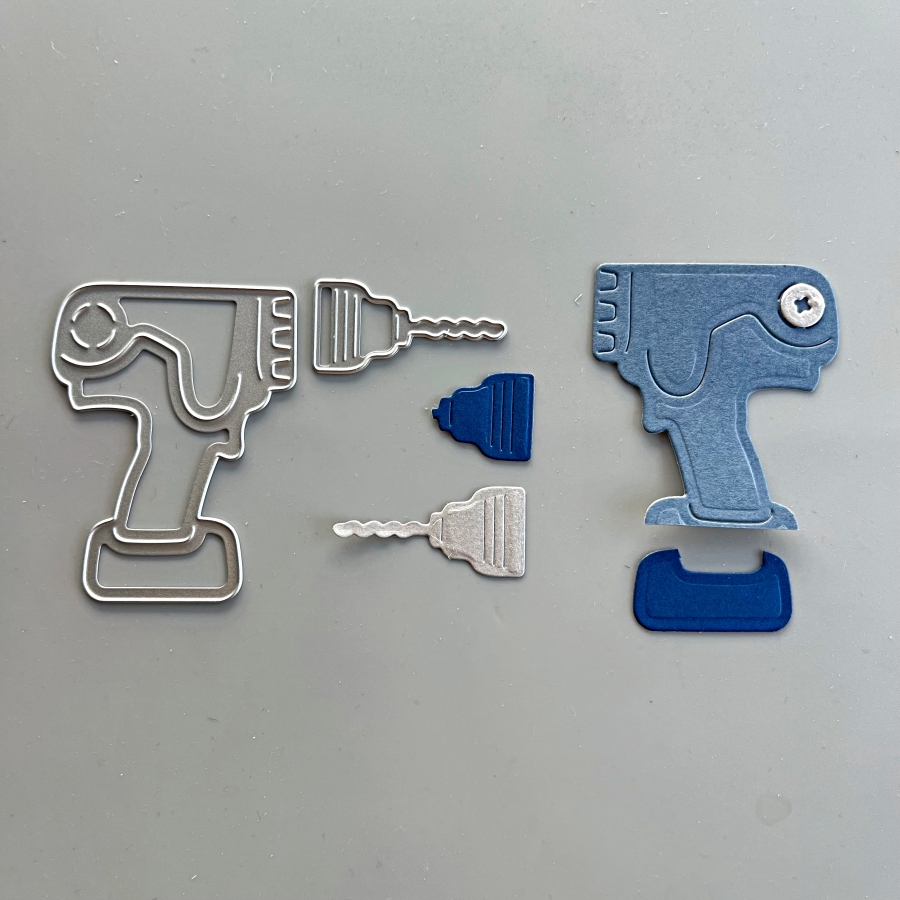
Step 3: For the power drill, I used Misty Moonlight and Blueberry Bushel cardstock. I also die cut a bolt from the silver cardstock to decorate this power drill.
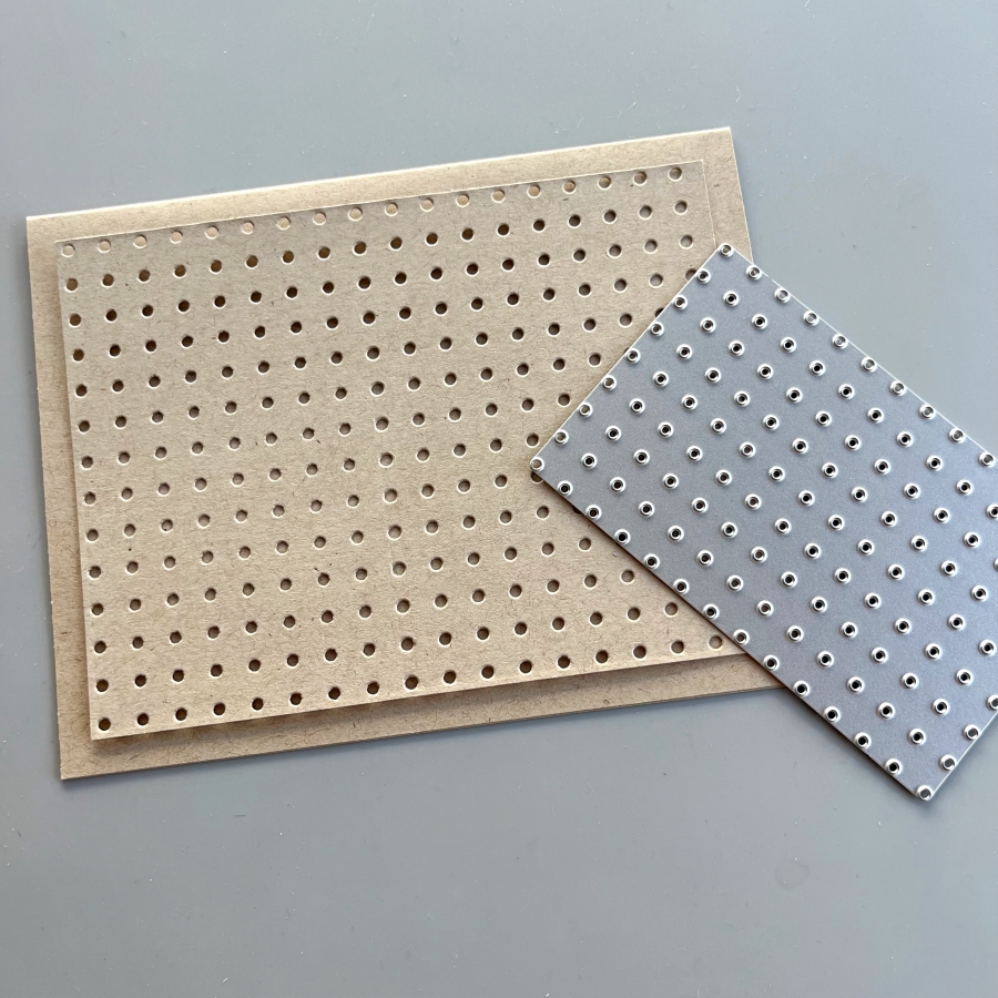
Step 4: One of the things I love about this die set is that it includes this pegboard die. You can extend the size of this die by matching up the holes on the die with a row of die cut holes and die cut again. They will fit like a puzzle and it almost feels like it is “locked” once the fitting is matched up.
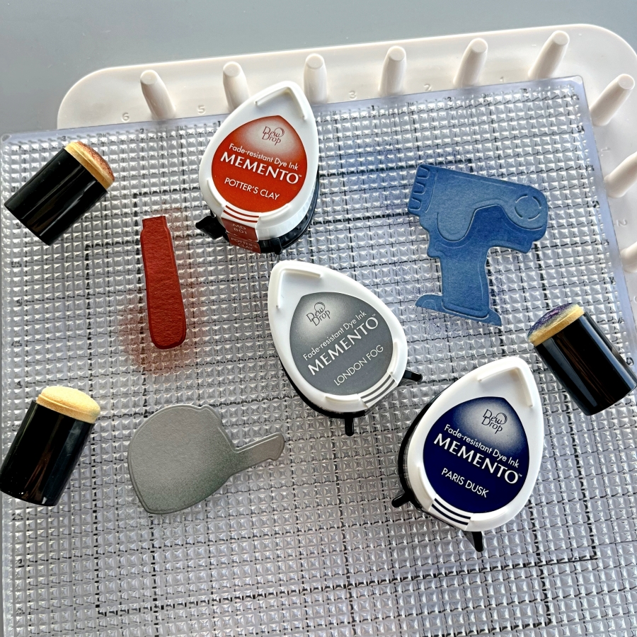
Step 5: I decided to dress up the die cuts further by ink blending the edges with Memento Inks. Since the die cut pieces are small, I opted for the small sponge daubers instead of my regular blending brushes. These small daubers are great for precise ink blending. I also lay the die cuts on Altenew’s Grip Mat, which conveniently secures the paper pieces and ink pads so they don’t shift around when ink blending.
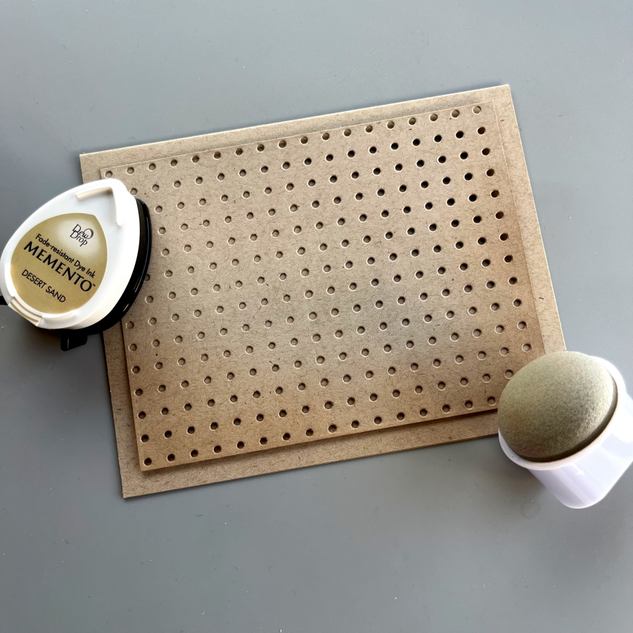
Step 6: The Jumbo Dauber is also a great blending tool. I used Desert Sand Memento Ink to add some shadows to the bottom edges of the pegboard piece.
Step 7: Finally, I adhered the pieces with Tear It Tape and stamped the sentiment from Stampin Up’s Heartfelt Hello set. This card was fun to put together and I hope you enjoyed it.
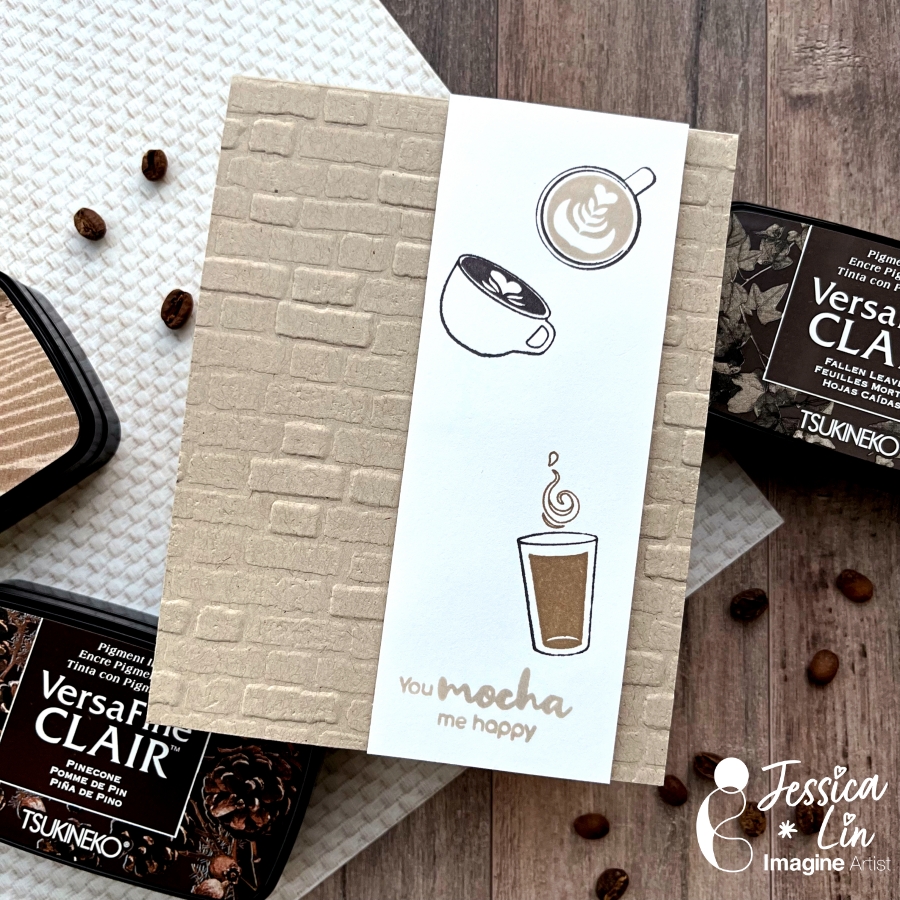
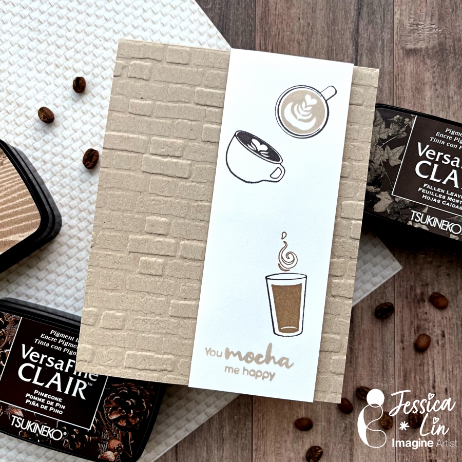
Hi everyone! It’s Jessica here. Today’s project is inspired by the Pantone color of this year – Mocha Mousse. It is such a warm, rich shade that is perfect for a coffee card! I decided to compare the different brown and earthy tones in the VersaFine Clair ink line as well. There are many options to choose from, and each is special on its own.
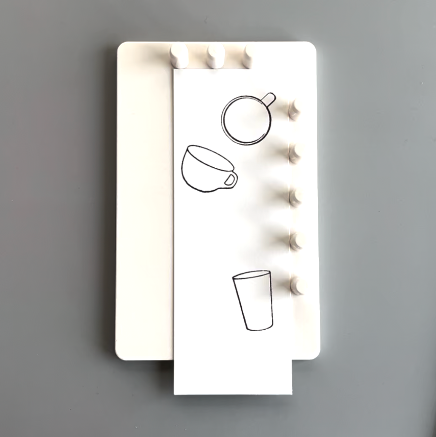
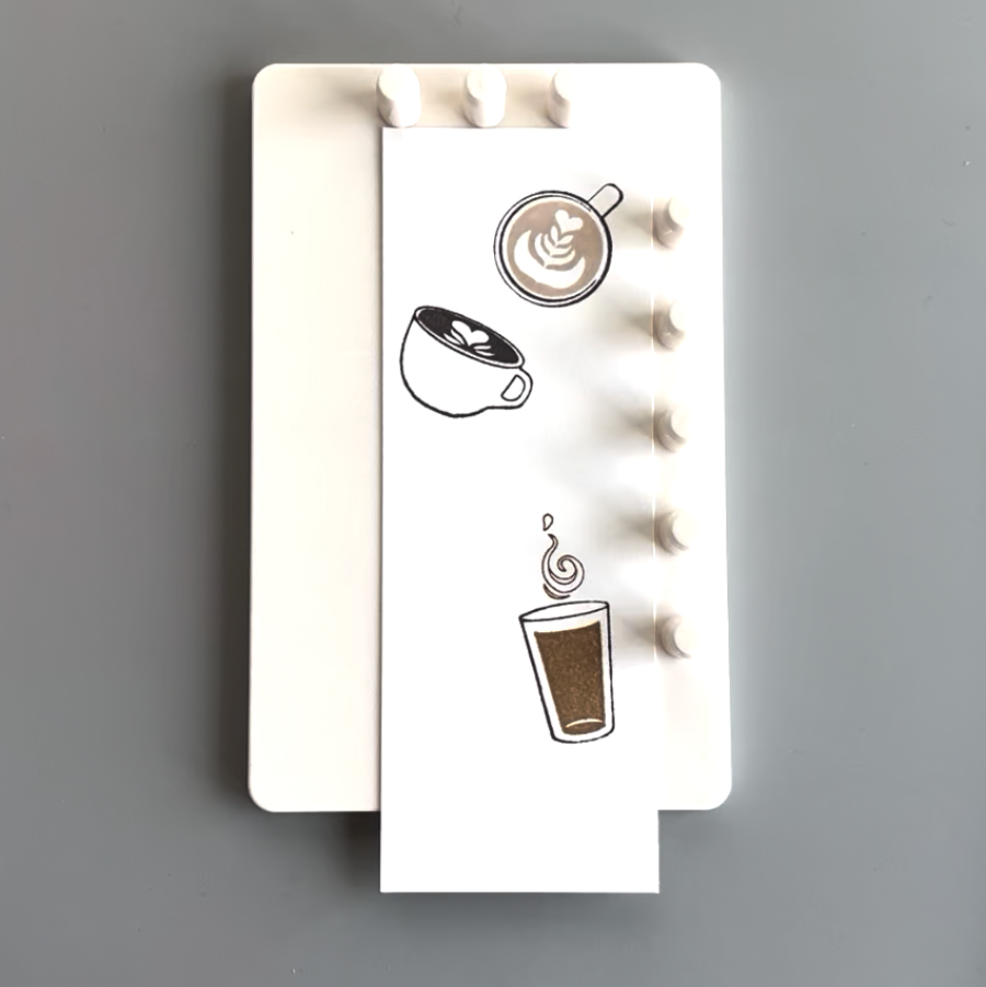
Step 1: Today I will be using an acrylic stamp set from iCrafter. It is called Latte Coffee and has several sets of coffee cup images. Since the image outlines are superfine, I chose VersaFine Clair inks to stamp with to ensure crisp, clean images. I typically stamp the outline images with Nocturne (the black color of this ink line). However, when I was experimenting with the colors, I found that Fallen Leaves is a great alternative. The dark brown color adds more warmth than black and complements the other earthy tones well. I love VersaFine Clair inks and use them very regularly, but Fallen Leaves was probably the one I reach for the least. I think I will start using it to stamp outline images from now on!
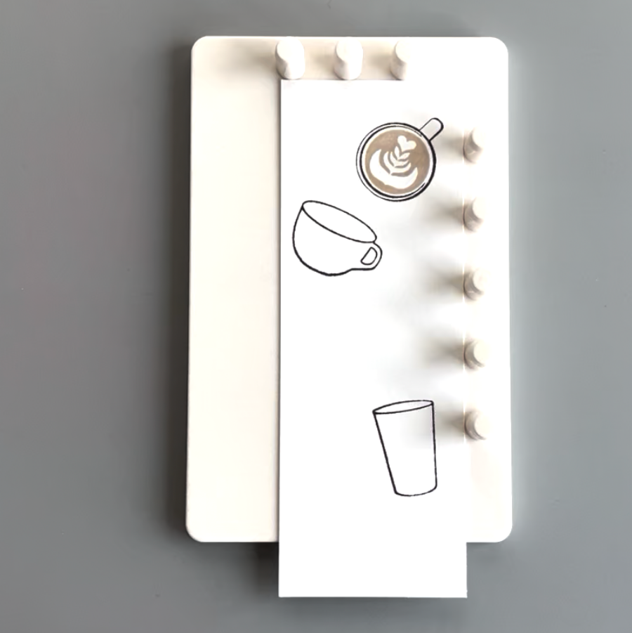
Step 2: I used Sand Dune to stamp the first latte art image. This is one of the newer VersaFine Clair colors. I am really happy that they added a lighter earth shade to this collection.
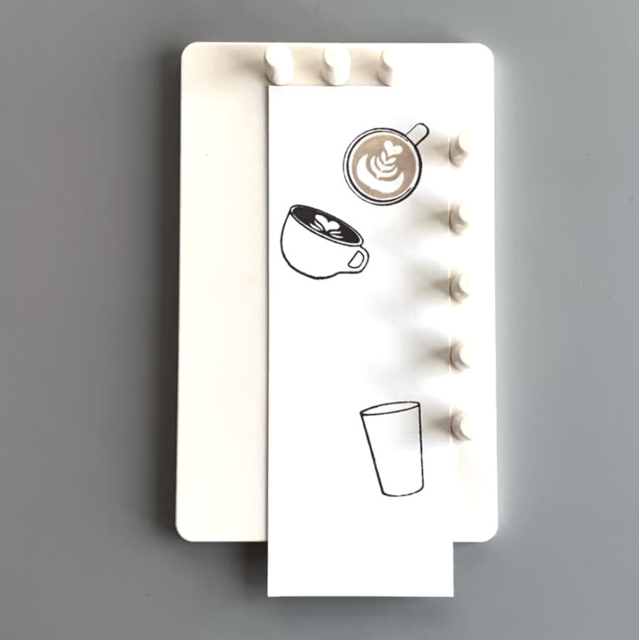
Step 3: For the second latte art stamp, I used Pinecone. This is also a rich, dark brown color. It is just a bit lighter than Fallen Leaves.
Step 4: I used Acorn for the bottom coffee image with the swirl. It is a great middle-tone that completes the brown color gradient.
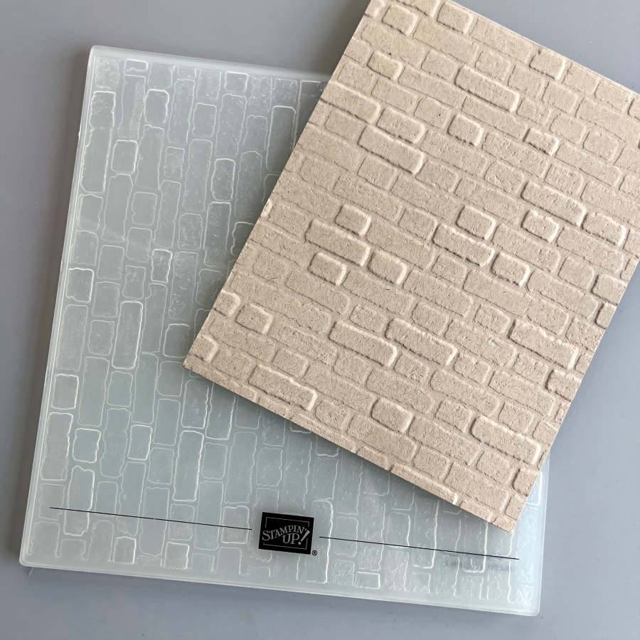
Step 5: Today’s card is simple and beginner-friendly with easy layered stamping. However, you could also add a little flair by embossing the front panel of the card base. Embossing folders are easy to use and add such a great wow factor to your project. The one I am using today is called Brick & Mortar. I think it reminds me of the walls of a cute coffee shop!
Step 6: Finally, I stamped this super cute sentiment with Sand Dune, and that completes today’s coffee card!
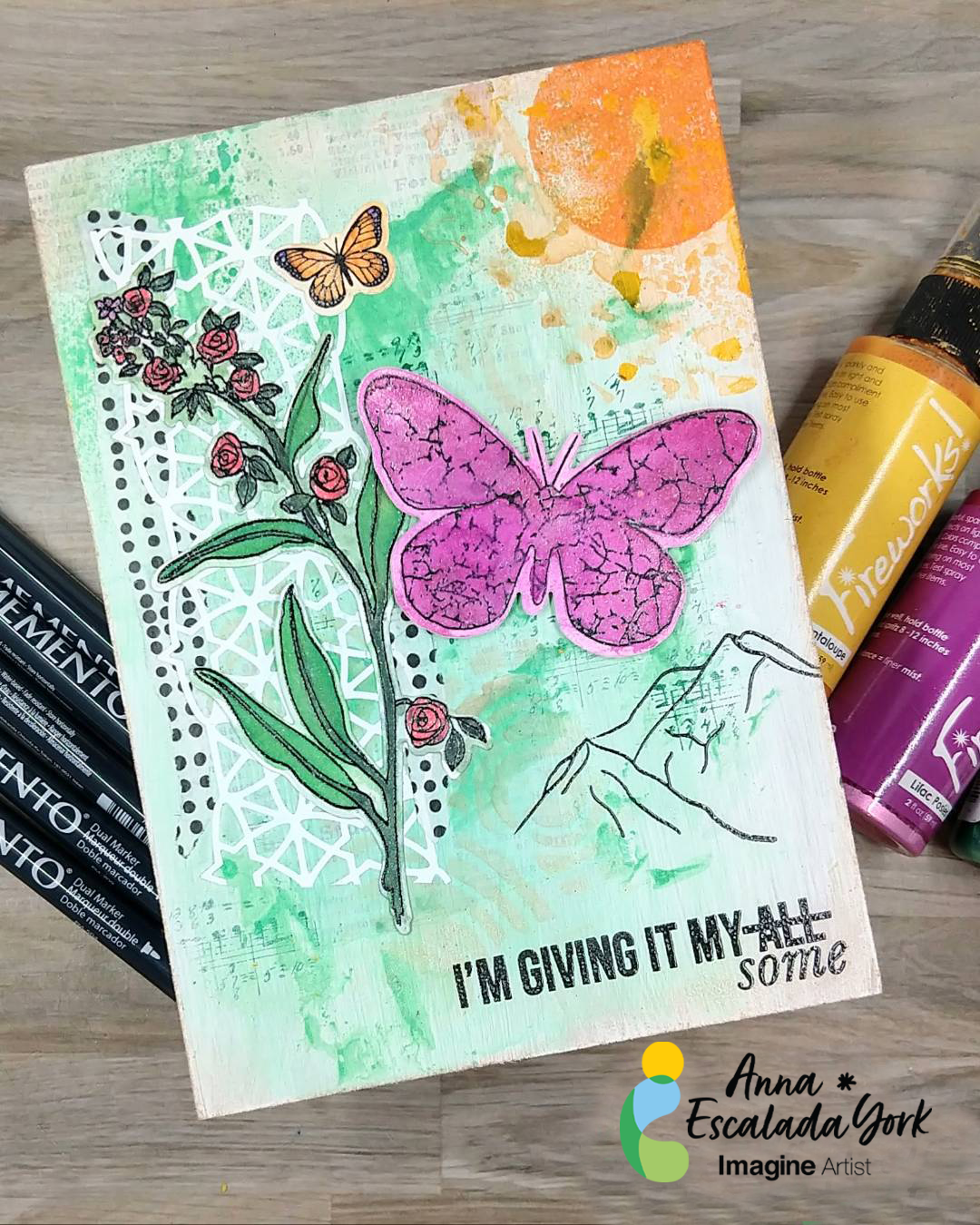
As a mom of a teen and tween, I wanted to make a snarky piece of home decor that would make them smile. So I decided to make a pretty piece of art that I was going to put up in our dining room.
Skill: Intermediate Time: 3 hours
Directions:
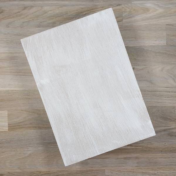
Step 1: Paint a thin layer of white gesso onto a 5” by 7” medium density fiberboard (MDF) panel.
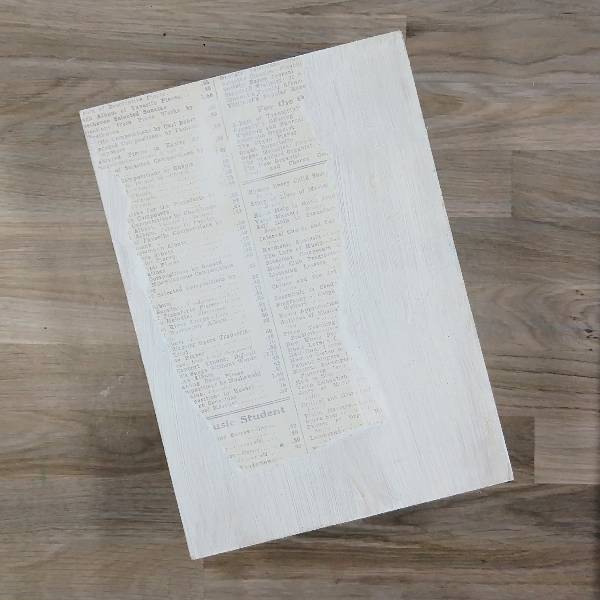
Step 2: Glue a ripped piece of text-based patterned paper onto the left side of the panel, making sure that the paper doesn’t go off the side of the fiberboard panel. Then paint over the whole panel again with more white gesso.
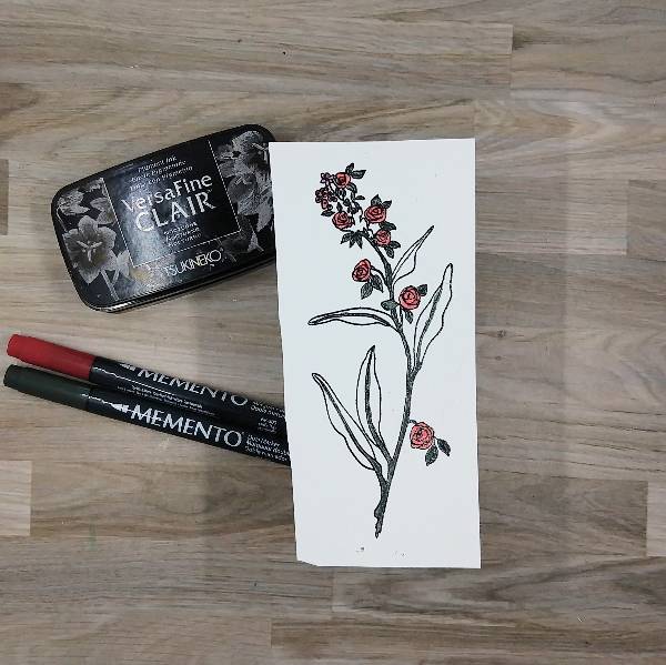
Step 3: Stamp a long, floral image onto white watercolor paper with Nocturne VersaFine Clair ink and then heat emboss it with clear embossing powder. Then color the main branch and ribs of the leaves with Northern Pine Memento Dual Marker and the flowers with Lady Bug Memento Dual Marker.
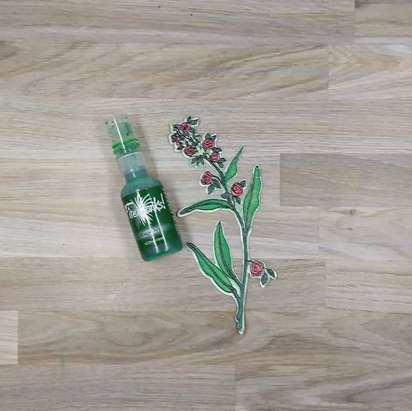
Step 4: Die cut the long, floral image. Spray Cottage Ivy Fireworks! Shimmery Craft Spray onto a piece of scrap acetate packaging and watercolor paint the leaves and edges of the floral image green, making sure to blend the darker marker color with the lighter spray. Set aside to dry.
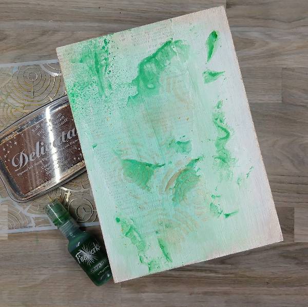
Step 5: Add texture to the fireboard panel. Use some of the remaining Cottage Ivy Fireworks! Shimmery Craft Spray mixed with more white gesso to create a light green paint. Paint the center part of the fireboard panel with the light green paint. Then watercolor smoosh more of the Cottage Ivy Fireworks! Shimmery Craft Spray (without any gesso) onto the panel to add texture. After the spray and paint have dried, press Celestial Copper Delicata Ink through a circular stencil overlapping the patterned paper. Then press the Celestial Copper Delicata Ink pad around the edges of the panel.
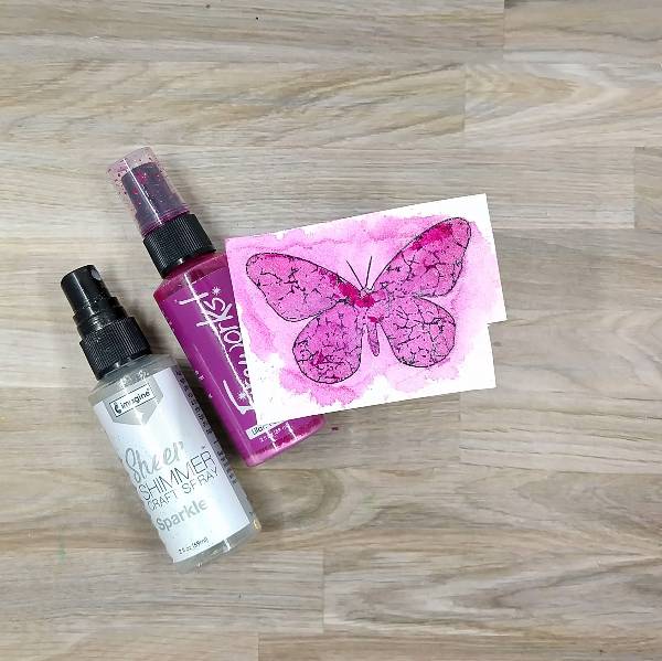
Step 6: Stamp a large butterfly on another piece of watercolor paper using Nocturne VersaFine Clair ink and heat emboss with more clear embossing powder. Then spray Lilac Posies Fireworks! Shimmery Craft Spray onto more scrap acetate packaging and watercolor spray the butterfly. Spray the whole thing with Sparkle Sheer Shimmer Craft Spray, which forces the Lilac Posies spray to diffuse outside of the butterfly’s outline. After the spray dried, die cut the butterfly with the corresponding die. Finally, paint the butterfly a second time with more of the Lilac Posies Fireworks! Shimmery Craft Spray to deepen the color. Set aside to dry.
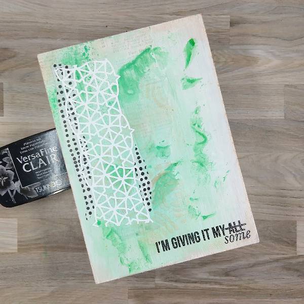
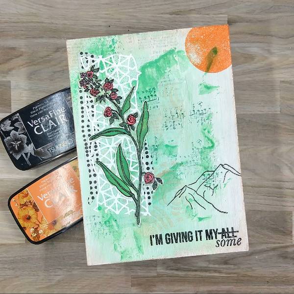
Step 7: Return to the background panel. Attach two types of washi tape to the left side of the panel–small pieces of black and white dotted washi tape and a white piece of washi tape that comes die cut in a lacy geometric pattern.
Then stamp a sentiment on the lower right part of the panel with more Nocturne VersaFine Clair in and heat emboss with more clear embossing powder.
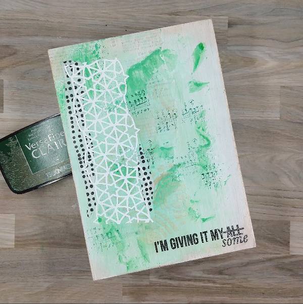
Step 8: Using a small musical note stamp, partially stamp the panel multiple times with Spuce VersaFine Clair ink.
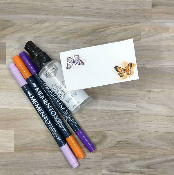
Step 9: Stamp the smaller butterfly twice with more Nocturne VersaFine Clair ink and heat emboss them with clear embossing powder. Then color them in with Lulu Lavender and Tangelo Memento Dual Markers (orange butterfly) and with Tangelo and Grape Jelly Memento Dual Markers (purple butterfly). Then spray both butterflies with Sparkle Sheer Shimmer Craft Spray. Once the spray had dried, die cut the butterflies with their corresponding die.
(In the final piece, only the orange butterfly colored with Tangelo and Lulu Lavender Memento Dual Markers was used.)
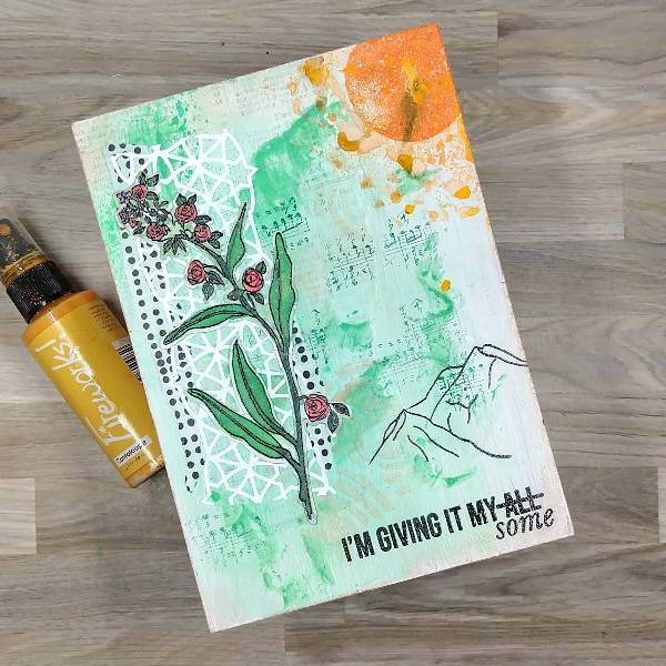
Step 10: Stamp part of the mountain outline stamp on the lower right part of the panel with more Nocturne VersaFine Clair ink and heat emboss with clear embossing powder. Then stamp part of the sun stamp with Summertime VersaFine Clair Ink.
Step 11: Spray around the sun with Cantaloupe Fireworks! Shimmery Craft Spray. Use a paintbrush or your finger to move dots of the Cantaloupe spray to make the spray less uniform and more organic.
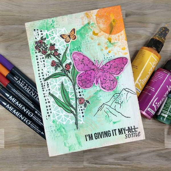
Step 12: Glue the flowers and small butterfly onto the panel. Attach the larger butterfly to the panel with foam tape. If desired, the outer tips of the top wings can be given additional dimension with two layers of foam tape, forcing them to curve.
Other Altenew – die set – All Things Orange Altenew – stamp set – All Things Orange Altenew – foam tape – Instant Dimension Foam Tape Altenew – washi tape – Many Dots Art Alternatives – MDF Panel (5” x 7”) Golden – Gesso Semi-Opaque Acrylic Primer Ink Road Stamps – stamp set – Roadies 8 (sentiment stamp) Visible Image – die set – Antisocial Butterfly Visible Image – stamp set – Antisocial Butterfly Circular stencil Die cut washi tape Watercolor paper Vellum Pencil Paintbrush Die cutting machine Paint brush Scissors Glue Text-based patterned paper Clear embossing powder
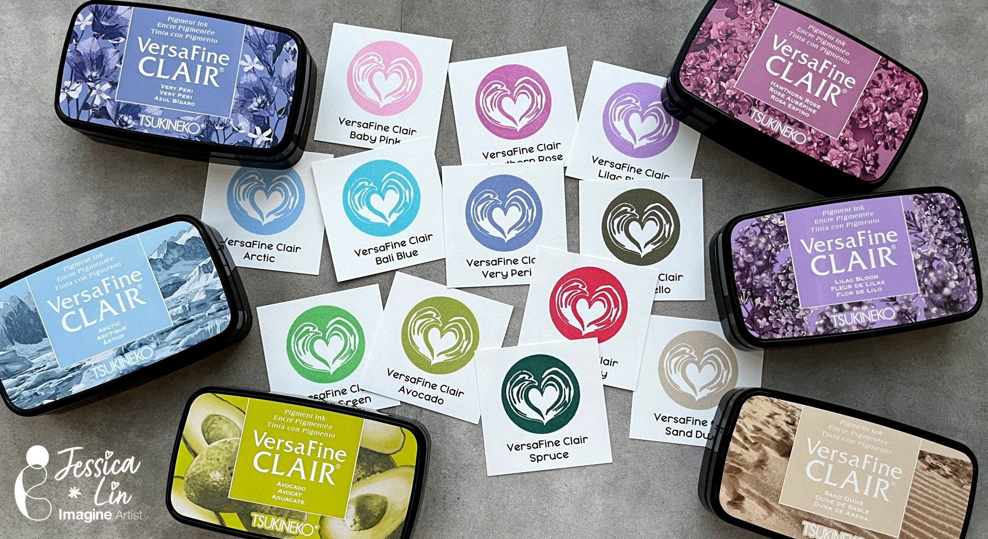
Hi everyone, it’s Jessica here. I am loving the new VersaFine Clair inks and I hope you are enjoying the creations from the Imagine team! Today I decided to create new ink swatches so I can have a quick on-hand reference for the colors.
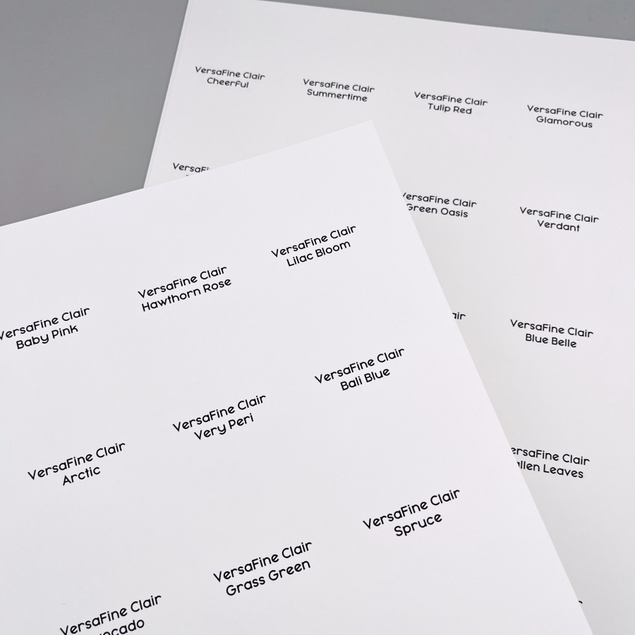
Step 1: Print the labels onto your go-to white cardstock. For me, that is Neenah Solar White Cover in 80lbs. I used Word to create the labels template and it takes a bit of trial and error to align everything perfectly. I found that checking the “show grid lines” box was helpful during the process.
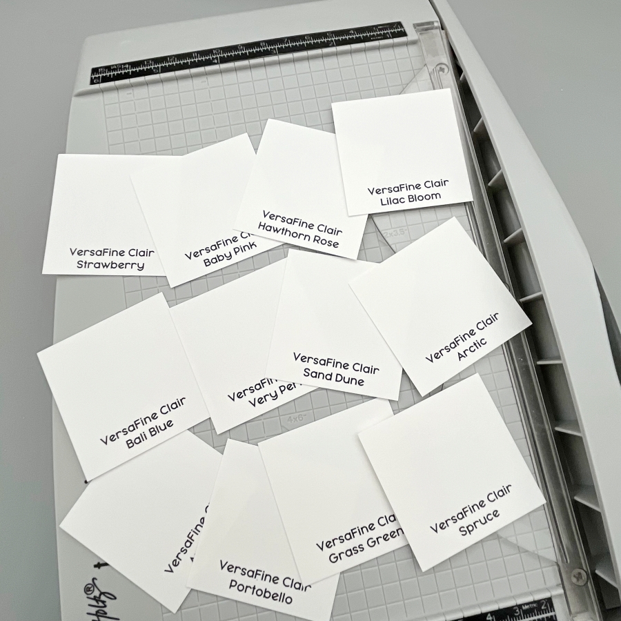
Step 2: Trim the labels to 2 x 2’’ squares. I used a standard 8.5 x 11’’ cardstock to print so each page equals to 20 labels at the end.
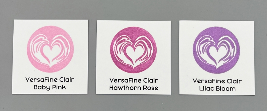
Step 3: Then stamp each label with the corresponding ink pad. I used a stamp positioning tool but it is completely optional. As for the stamp used for ink swatching, I would recommend an image that is solid so that there is enough area to truly showcase the ink color. I like to pick something that also has some fine lines; some inks have great coverage but are not the best at showing fine details. I recently bought a coffee-themed stamp set called Latte Love from Stampin’ Up!, and this coffee swirl stamp is perfect.
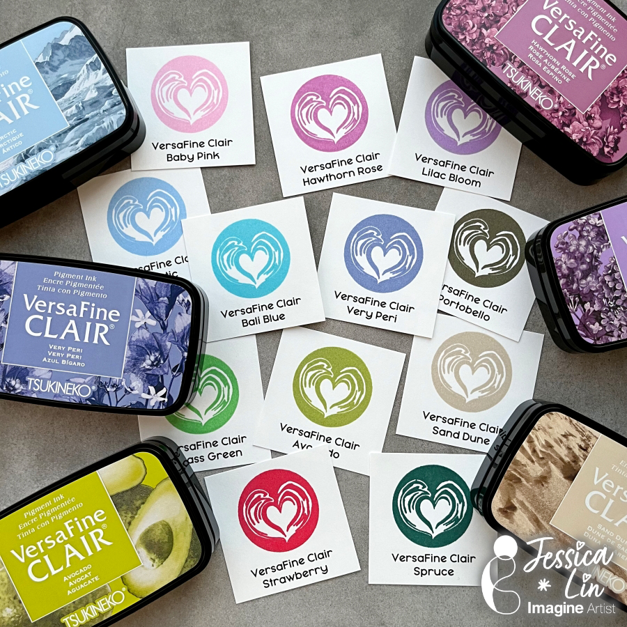
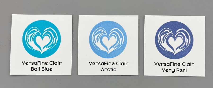
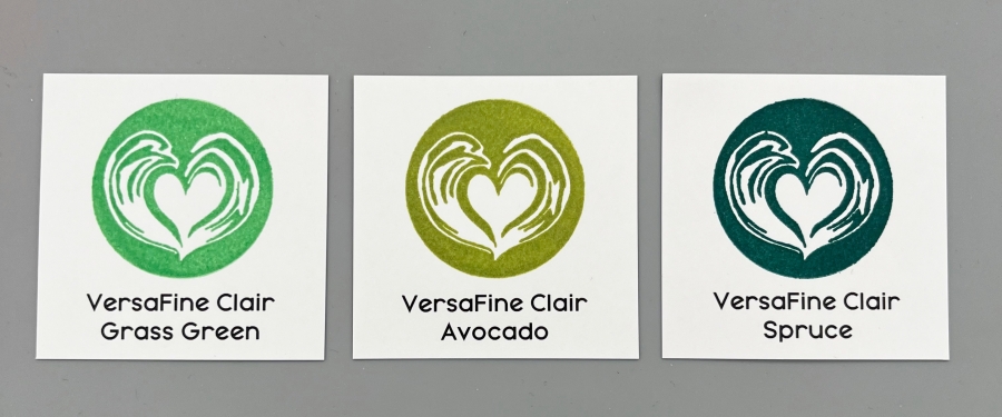
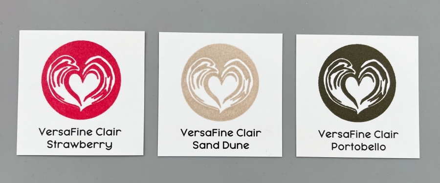
Below are all the new VersaFine Clair colors. As you can see, they are great inks that offer great ink coverage and retain super-fine details of the stamps. I double stamped most of them as I
typically double stamp my images when I am creating. I tried to minimize the amount of editing on these images so the colors are kept as true as possible. Hopefully they can provide a visual for you as well if you are interested in these inks.
I hope today’s tutorial inspires you to create new ink swatches! They are handy tools and the ink swatching process is so cathartic. I can’t wait to create more projects with these inks!
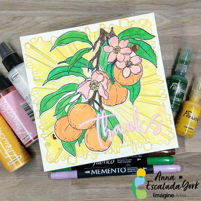
I used to be intimidated by the idea of multimedia cards, but all they are cards that have different types of products. This card features stamping, watercoloring with sprays and Amplify! Ink, and embossing.
Skill: Intermediate Time: 2 hours
Directions:
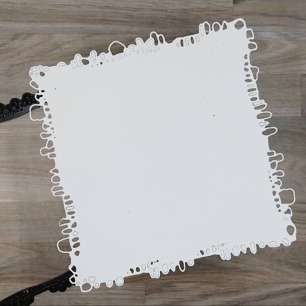
Step 1: Die cut a piece of watercolor paper.
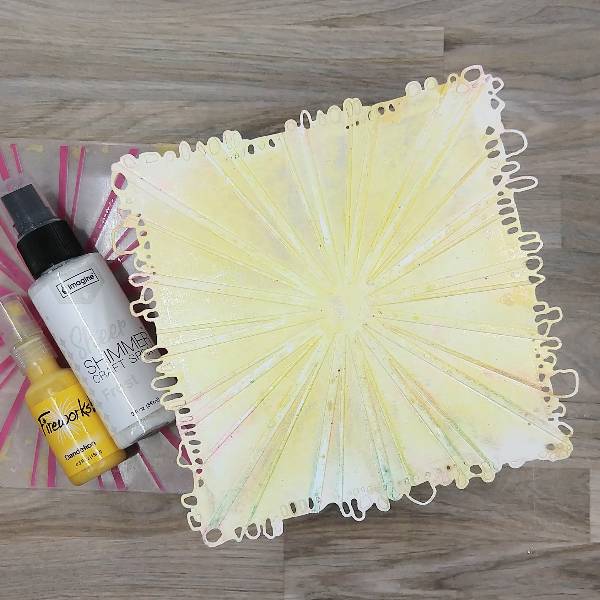
Step 2: Spray Dandelion Fireworks! Shimmery Craft Spray onto the center part of an embossing folder and Frost Sheer Shimmer Craft Spray around the edges. Place the die cut watercolor panel in the embossing folder. (The folder had some residual color from a previous project, but it will be covered up later.)
Step 3: Rub a Sunflower Yellow Brilliance Ink pad over the edges of the embossed watercolor panel.
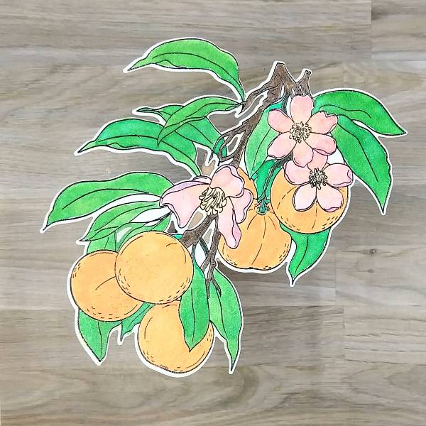
Step 4: Stamp the main image onto another piece of watercolor paper with Nocturne VersaFine Clair ink. Heat emboss with clear embossing powder.
Step 5: Use a variety of sprays and other media to color in the image.
The leaves were watercolored with Cottage Ivy Fireworks! Shimmery Craft Spray.
The green stems were colored with Emerald Fabrico Dual Marker.
The small branches were colored in with Rich Cocoa Memento Dual Marker.
The flowers were watercolored with Angel Pink Fireworks! Shimmery Craft Spray on the petals. After the petals dried, the center of the flower and the center part of the petals were water colored with Cantaloupe Shimmery Craft Spray. Finally, the outside parts of the petals were colored with Lulu Lavender Memento Dual Marker.
Electric Orange Radiant Neon Amplify! pigment ink and Cantaloupe Shimmery Craft Spray were mixed on a piece of scrap acetate and was watercolored onto the tangerines.
Step 6: Die cut the image with the corresponding die.
Step 7: Press Angel Pink Memento Dye Ink onto a scrap of watercolor paper. After the ink dries, spray Angel Pink Fireworks! Shimmery Craft Spray onto the same scrap of watercolor paper and allow it to dry.
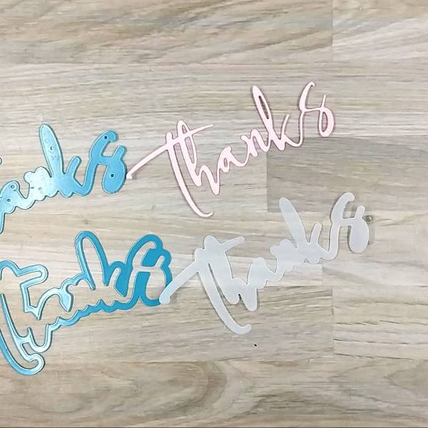
Step 8: Die cut the pink watercolor paper with a thanks sentiment die and a piece of vellum with the sentiment’s shadow die.
Step 9: Glue the tangerine image onto the embossed watercolor background panel. Then glue the sentiment die cut to the vellum shadow sentiment die cut. Glue the sentiment onto the panel as well.
Step 10: Glue the panel onto a 6” by 6” square cardbase. Glue sequins on the lower left and upper right parts of the panel to finish the card.
AALL & Create – die set – Nature’s Doily Alex Syberia Designs – die set – Large Thanks die Altenew- die set – Tangerine Grove Altenew- stamp set – Tangerine Grove Catherine Pooler – sequin mix – València Sequin Mix Pink & Main – Embossing Folder – Sun Ray Clear Embossing Powder 6” by 6” cardbase Watercolor paper Vellum Die cutting machine Scissors Glue