By Anna Escalada York
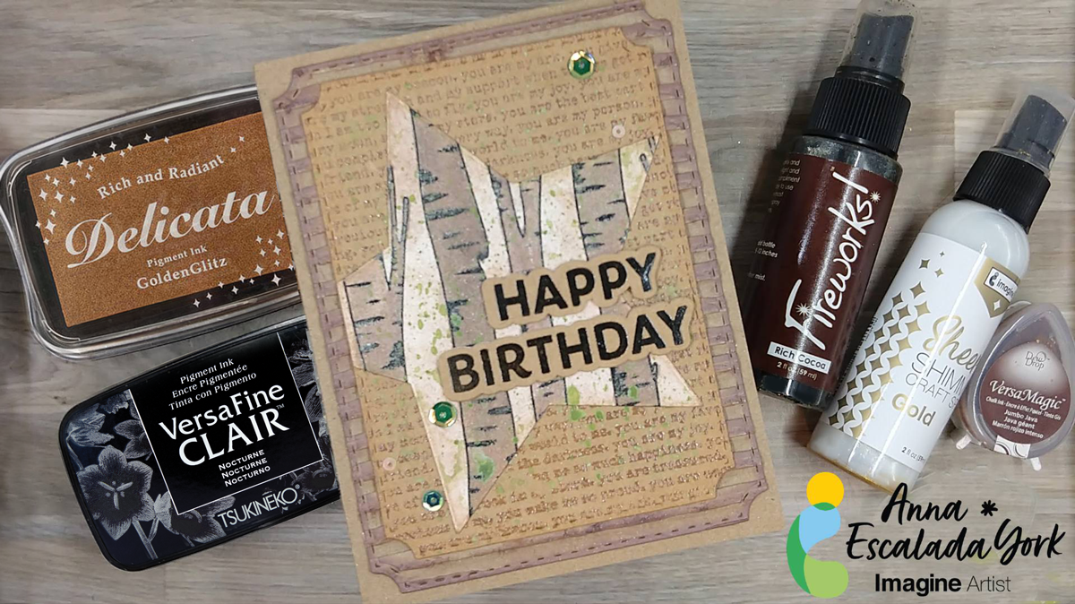
I wanted to use my husband’s birthday to make him a personalized birthday card. He loves to be in nature and loves it when I use recycled materials (mostly because then we don’t have to buy new things). I also added a background that expresses how I feel about him.
Skill Level: Intermediate
Time: 2 hours
Directions:
Step 1:
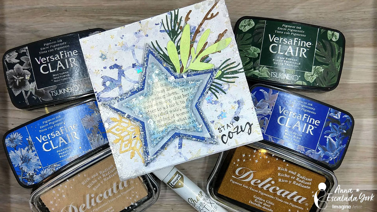
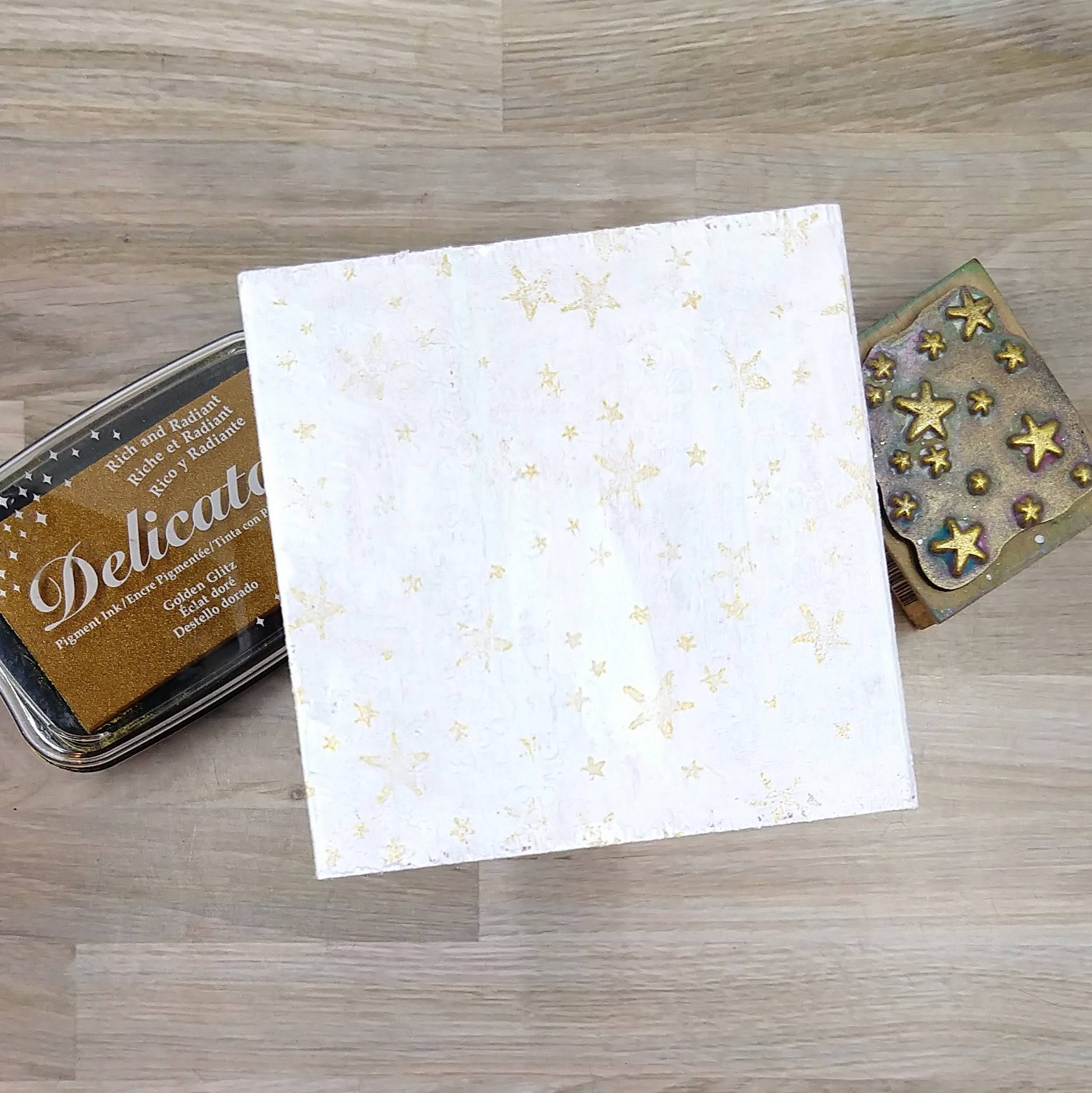
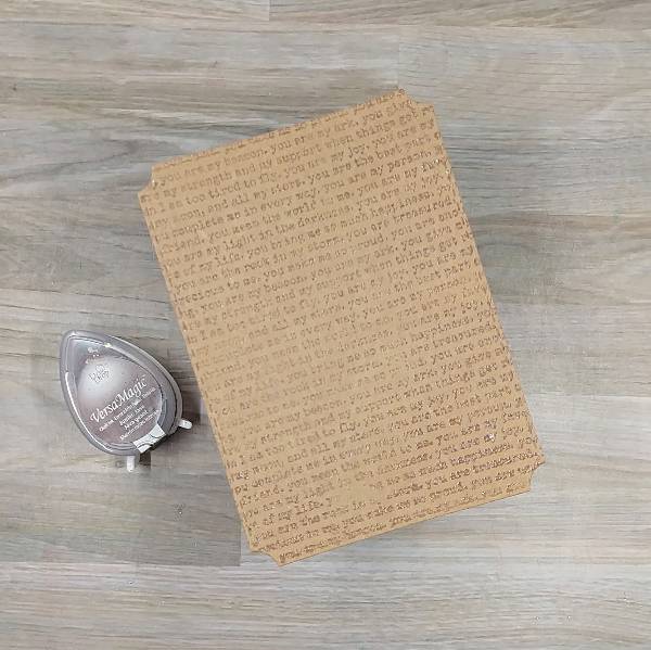
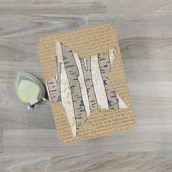
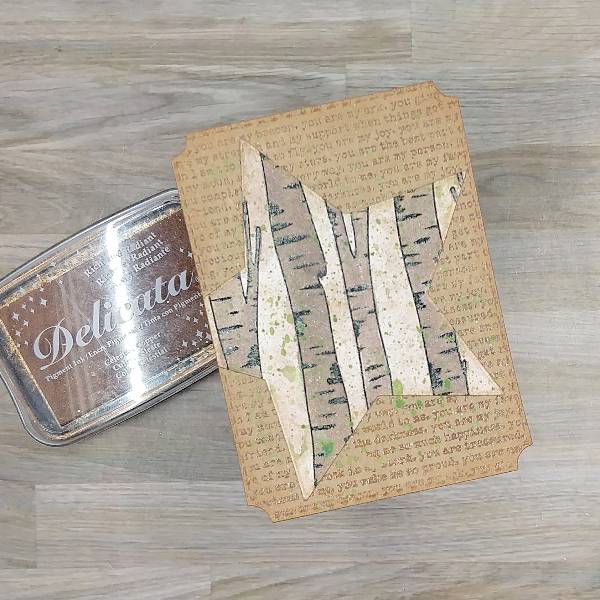
Stamp a piece of kraft cardstock with a text-based background stamp with Jumbo Java VersaMagic Chalk Ink. Heat emboss with clear embossing powder. Die cut the panel with the second-largest die from a nested A2-sized nested die set.
Step 2:
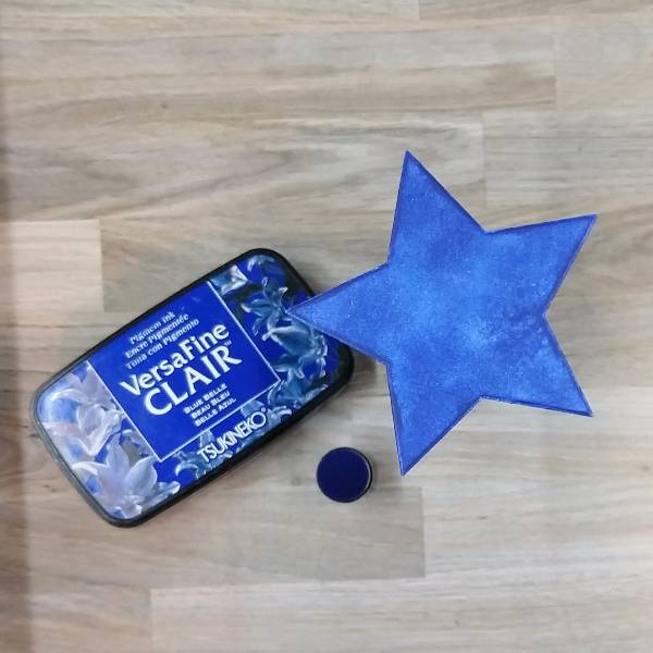
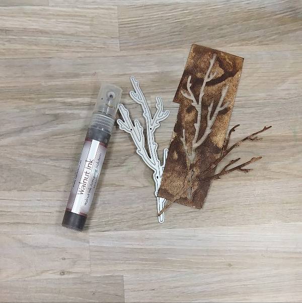
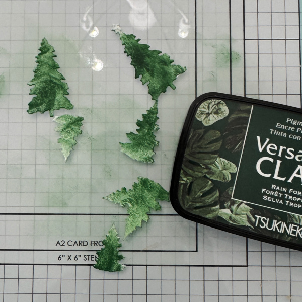
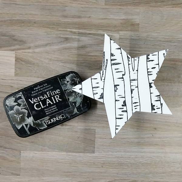
Stamp a large tree stamp set on a piece of watercolor paper with Nocturne VersaFine Clair ink. Heat emboss with clear embossing powder. Die cut with a mid-sized star die from a nested star die set.
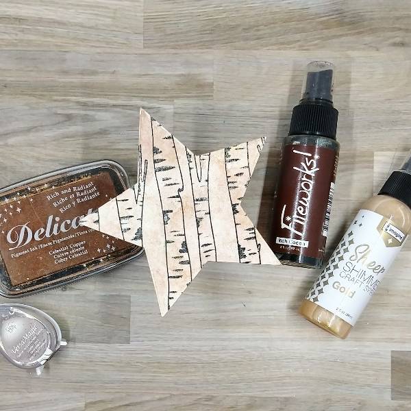
Step 3:
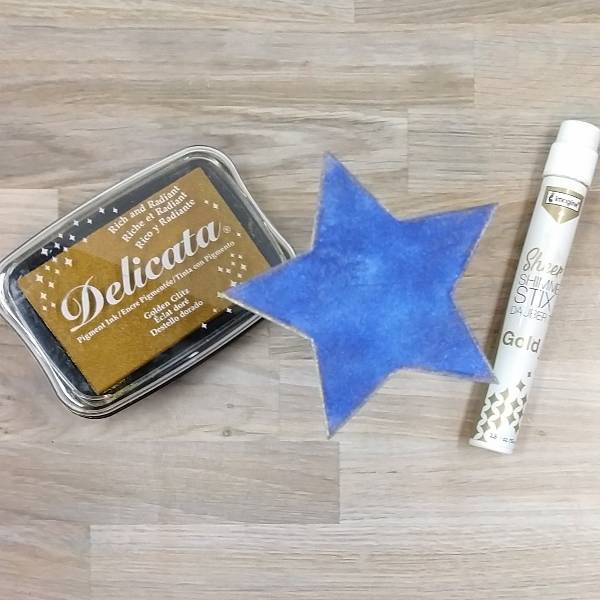
Lightly spray Rich Cocoa Fireworks! Craft Spray and Gold Sheer Shimmer Craft Spray onto the watercolor stamped star. Blot a little of the spray off with a paper towel and allow to dry. Then Then press Celestial Copper Delicata ink onto a piece of acetate packaging and spray with water. Watercolor smoosh the star by pressing the liquid copper onto the panel. Then repeat the watercolor smooshing with Jumbo Java VersaMagic Chalk Ink mixed with water on the acetate. Let the panel dry again.

Step 4:
Mix some of the remaining Jumbo Java VersaMagic Chalk Ink and water with more of the Rich Cocoa Fireworks! Craft Spray to make a darker brown watercolor. Paint the trees with the watercolor. Allow to dry. Apply a second coat of watercolor to a few trees to add interest and darker trees. Allow to dry a second time.
Step 5:
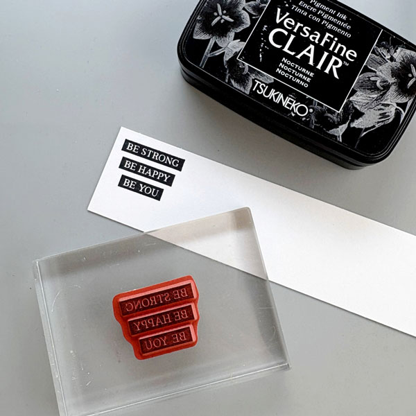
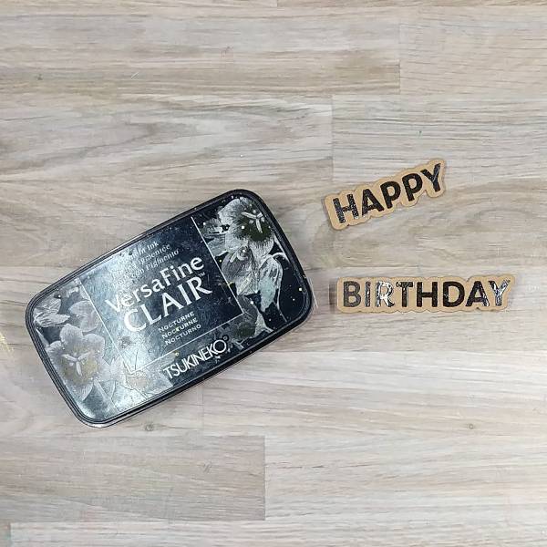
Stamp a sentiment on kraft cardstock with Nocturne VersaFine Clair ink. Then heat emboss with more clear embossing powder. Then die cut with the corresponding dies.
Optional: Die cut 2 more die cut layers for each of the sentiment (3 layers total for each of the dies–1 that is the stamped kraft layer, and two scrap layers). Glue the layers together and set aside to dry.
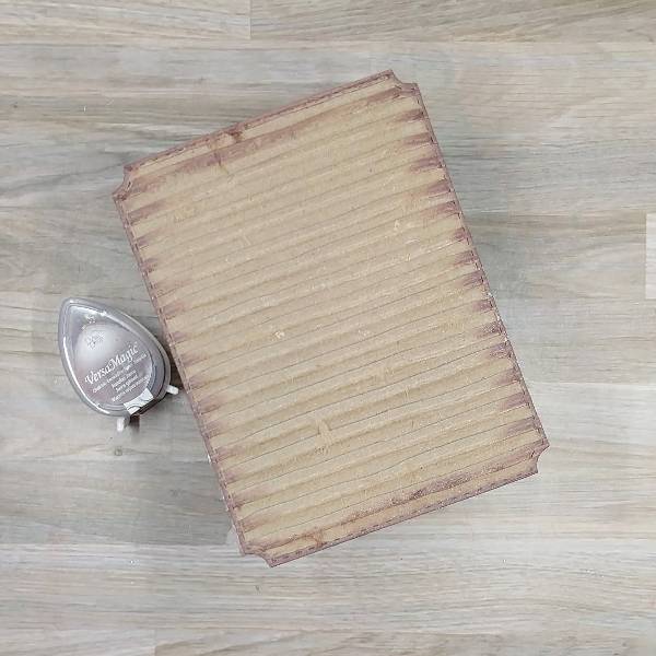
Step 6:
Die cut a piece of corrugated cardboard with the largest die from an A2-sized nesting panel die set. Then brush the edges of the panel with Jumbo Java VersaMagic Chalk Ink.
Step 7:
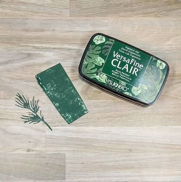
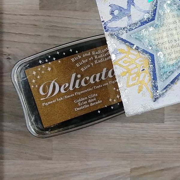
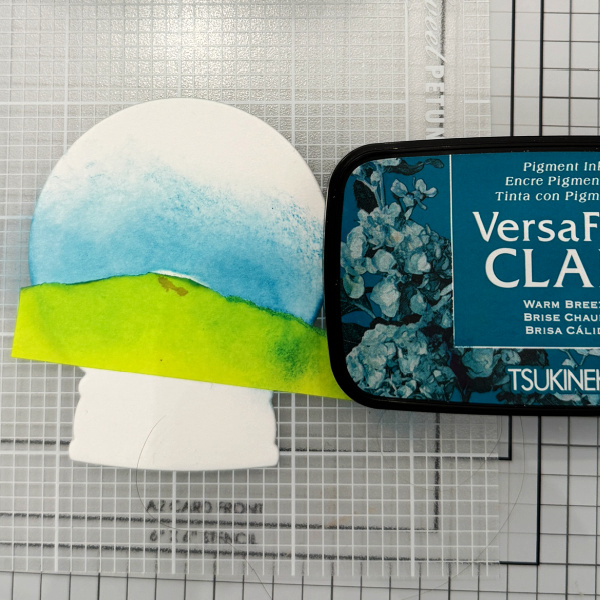
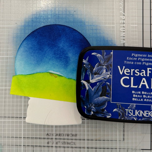
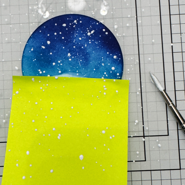
Use a sponge dauber to ink blend the edges of the star with Celestial Copper Delicata ink. Glue the die cut star onto the smaller, stamped panel. Trim the overhanging left part of the star. Then press Tea Leaves VersaMagic Chalk Ink onto acetate packaging and spray with water.
Splatter the Tea Leaves-colored watercolor onto the panel. Add a couple of watercolor smooshed areas to add interest (or to cover areas where you want splatters but the splatters are not doing what you want). Allow to dry.
Step 8:
Brush the edges of the smaller, stamped panel with the Celestial Copper Delicata ink pad.
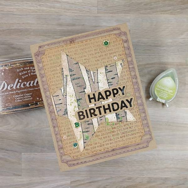
Step 9:
Assemble the card. Glue the two panels together. Glue the sentiment strips onto the panel. Then add sequins on the lower left and upper right parts of the card. Then glue the whole thing onto an A2-sized kraft card base.
Art Supplies
Imagine
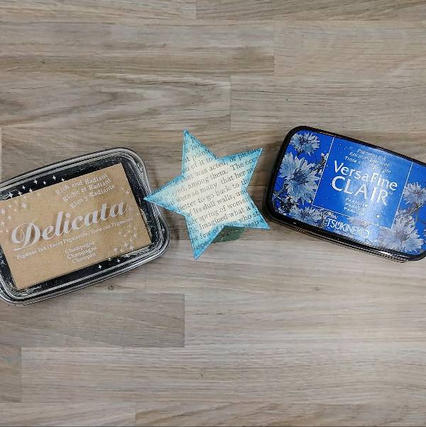
• Delicata Ink – Celestial Copper
• Fireworks! Craft Spray – Rich Cocoa
• Sheer Shimmer Craft Spray – Gold
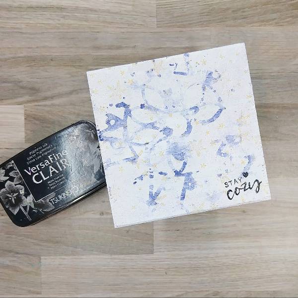
• VersaFine Clair ink – Nocturne
• VersaMagic Chalk ink – Jumbo Java
• VersaMagic Chalk ink – Tea Leaves
• Sponge Dauber
Other
• Altenew – die set – Wings & Petals (for the sentiment)
• Altenew – stamp set – Wings & Petals (for the sentiment)
• Catherine Pooler – sequin mix – Wintergreen
• Pink and Main – die set – Notched Corners
• Simon Hurley create – background stamp – Timber!
• Simon Says Stamp – die set – Nested Stars Wafer Dies
• Simon Says Stamp – background stamp – You Are
• Kraft cardstock
• Watercolor paper
• Corrugated cardboard
• Clear Embossing Powder