By Jessica Lin
Skill: Intermediate
Time: 30 minutes
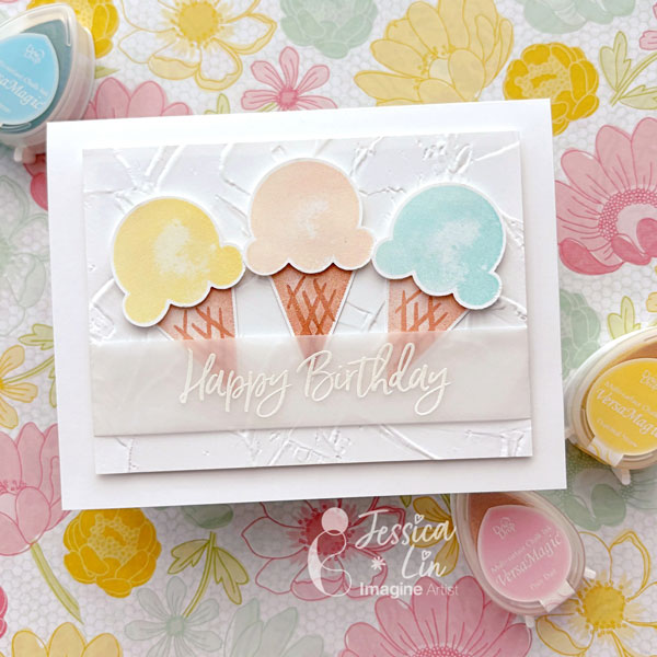
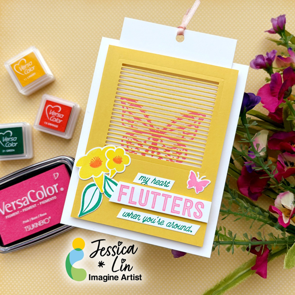
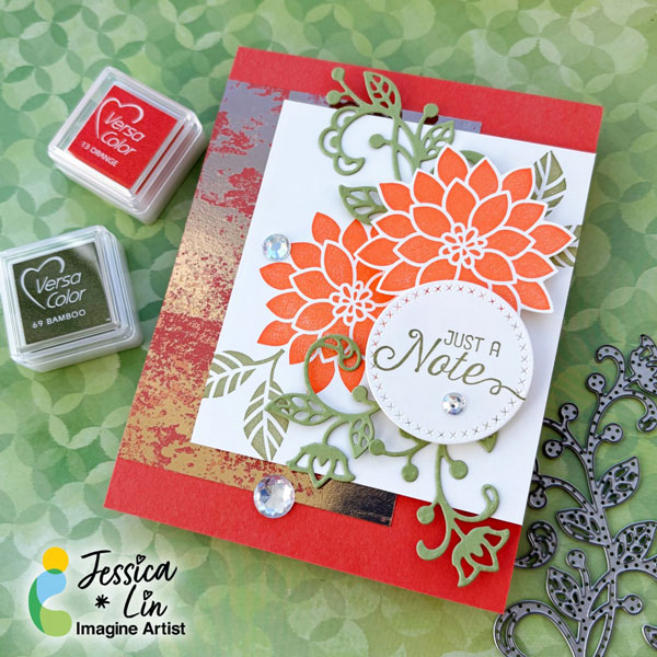
Hi everyone! It’s Jessica here. I am so happy to be on Imagine Crafts’ design team again for 2026. If you have seen some of my creations before, you would notice that I love bold, bright colors. Today, I am sharing a floral card that features this vibrant orange from the VersaColor ink line.
Step 1:
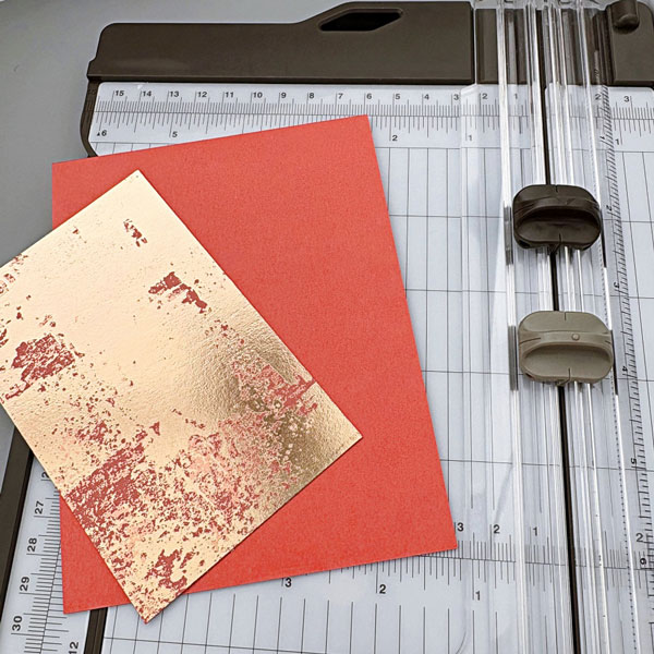
I started out by preparing an A2 card base with Calypso Coral cardstock. Then I trimmed a piece of Dry Brushed Metallic paper to 3’’ x 4.5’’ as a background accent.
Step 2:
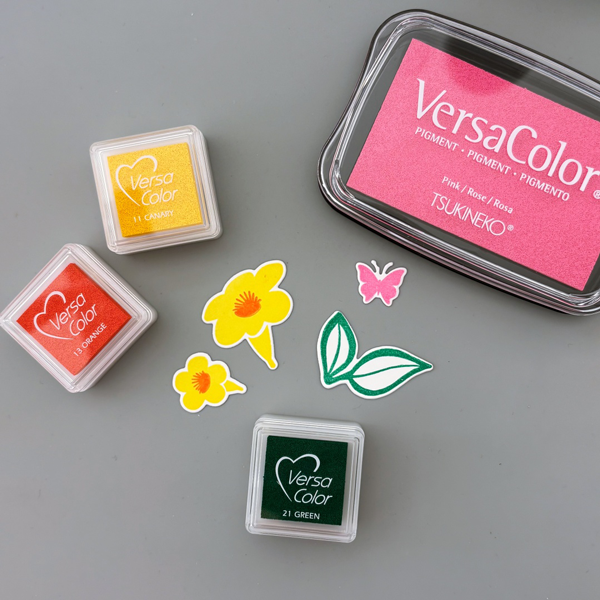
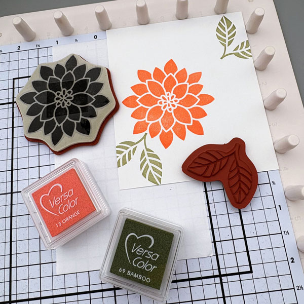
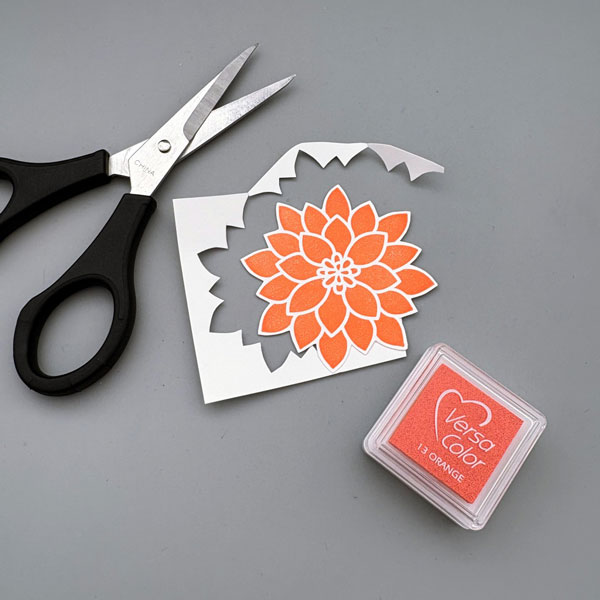
The stamp set I am using today is Flourishing Phrases from Stampin’ Up. I stamped the flower image with VersaColor Orange ink pad on a piece of 3.5’’ x 4’’ cardstock. For the leaves, I used VersaColor Bamboo ink pad.
Step 3:
I stamped another flower image on a scrap piece of cardstock and fussy cut it along the edge.
Step 4:
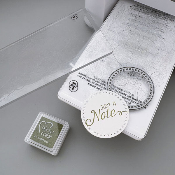
Then I die cut a circle with cross-stitch details and stamped the sentiment with VersaColor Bamboo ink.
Step 5:
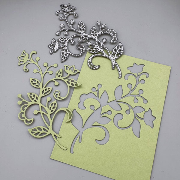
The coordinating die set includes various floral designs that work well both by themselves and with the stamp images. I decided to die cut the largest design and cut it into 3 pieces to decorate around the sentiment. Finally, I adhered all of the elements onto the cardbase, added some rhinestones, and the card is complete!
Imagine Supplies:
Other Supplies:
- Stampin’ Up! – Stamps – Flourishing Phrases
- Stampin’ Up! – Dies – Flourish Thinlits
- Stampin’ Up! – Patterned Paper – Dry Brushed Metallic
- Stampin’ Up! – Cardstock – Calypso Coral