By Jessica Lin
Skill: Advanced
Time: 30 minutes
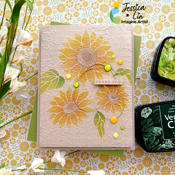
Hi everyone! It’s Jessica here. I am excited to share a wedding card idea today. This elegant layout is also perfect for wedding invitations. I love how this turned out and I’ll definitely be making more color variations in the future!
Step 1:
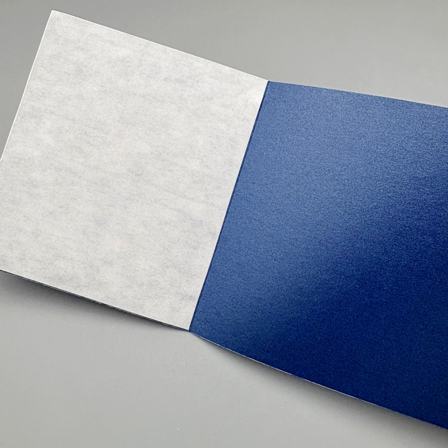
On a piece of 4 ¼’’ x 5 ½’’ cardstock, score at 3 ⅜’’ and 8 ⅞’’. Then adhere Stick-It adhesive to the inner left and right flaps of the card. The Stick-It adhesive is great for sticking down large pieces of intricate die cut. If you don’t have the Stick-It adhesive, a great alternative would be liquid glue with fine-tip nozzles, such as the On-Point Glue.
Step 2:
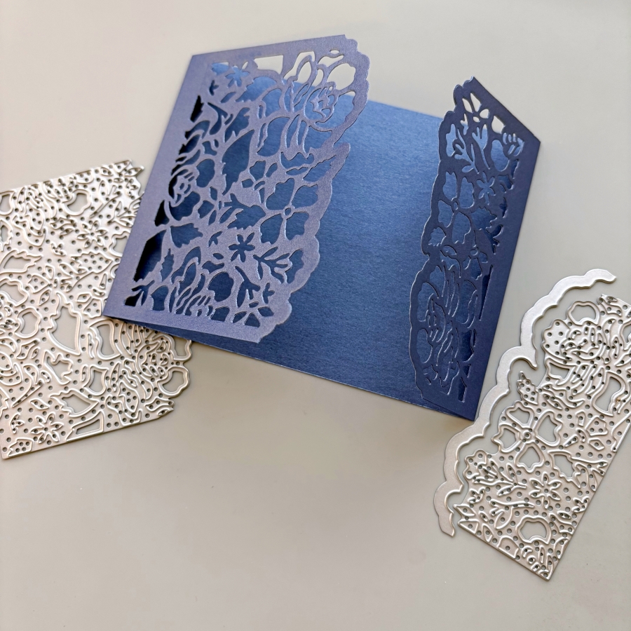
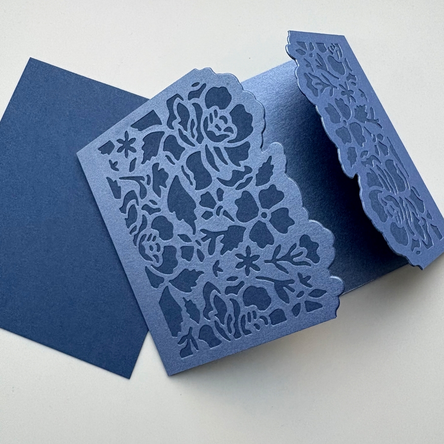
Die cut the left and right flaps with Stampin’ Up’s Detailed Floral dies. This would create beautiful card openings with delicate floral designs.
Step 3:
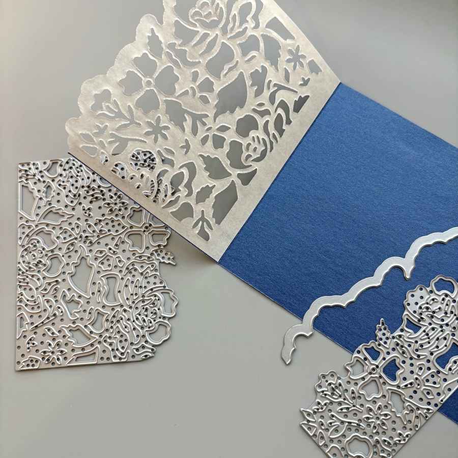
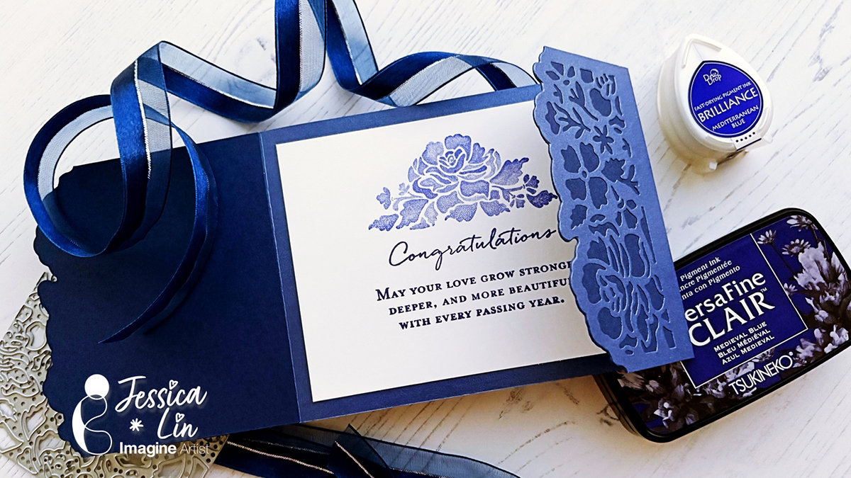
Peel off the Stick-It adhesive backing and adhere it to a piece of navy cardstock. Burnish the die cut area with a bone folder to ensure the two pieces of cardstock are fully stuck together.
Step 4:
Trim the excess navy cardstock along the top and bottom edges with a pair of scissors. Then die cut the floral border again with the Detailed Floral die. I chose to die cut right up against the edge of the first die cut layer. Alternatively, you could leave a border along the die cut piece if you place the die further away from the edge.
Step 5:
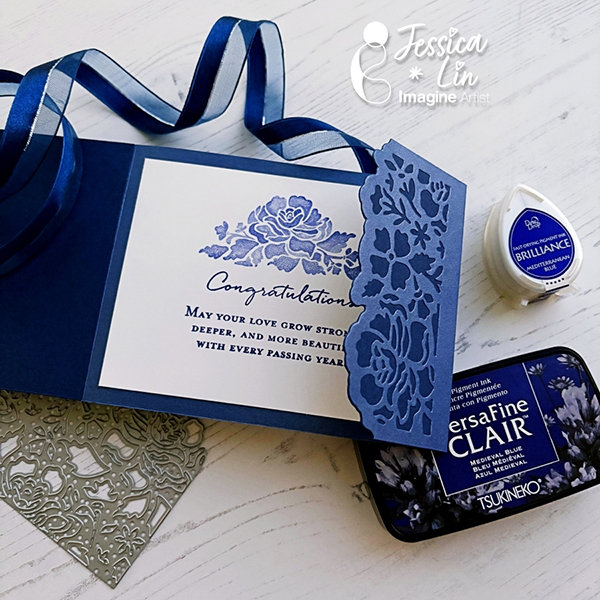
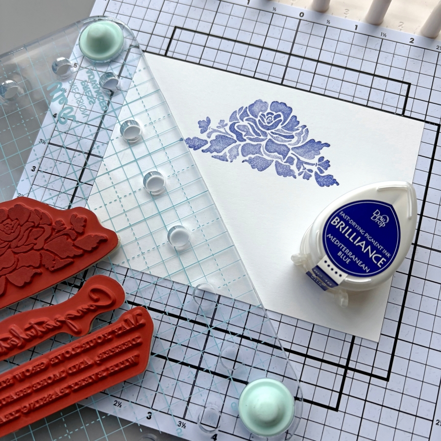
I stamped the coordinating floral stamp from Stampin’ Up’s Floral Phrases stamp set. I inked the stamp lightly with Brilliance Mediterranean Blue ink pad so that the shading details of the stamp could be captured.
Step 6:
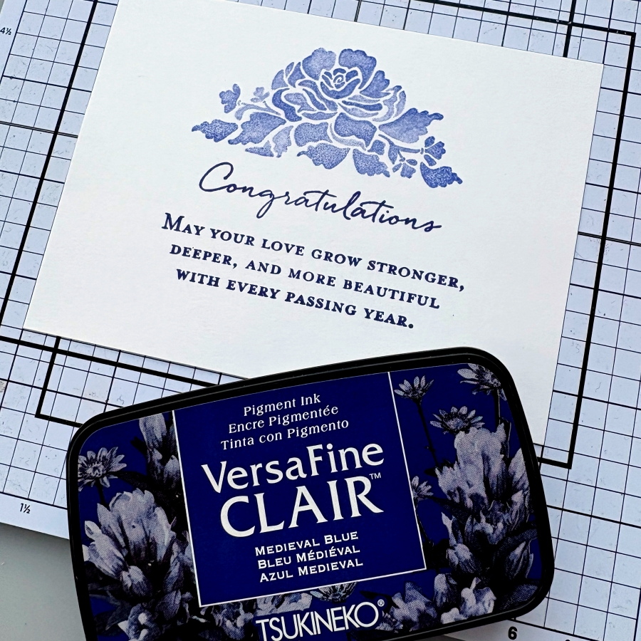
This stamp set also includes some beautiful sentiment stamps that are perfect for wedding cards. I decided to use VersaFine Clair Medieval Blue ink pad to stamp the sentiment since this ink is known for giving crisp, clean lines. It is my favorite type of ink pad for sentiment stamping.
Step 7:
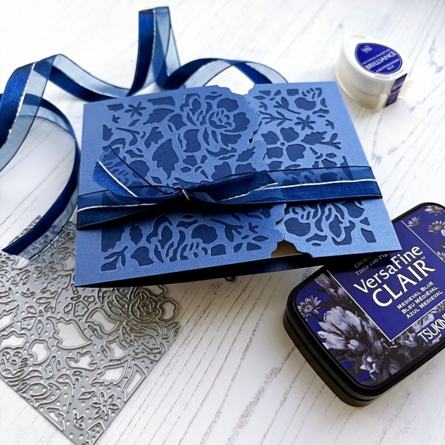
Since this card has asymmetrical folds, I added a ribbon belly band so that the card flaps would be kept in place. Then I cut a short piece of ribbon and tied it around the belly bend to create the bow.
Imagine Supplies:
- Brilliance – Mediterranean Blue
- VersaFine Clair – Medieval Blue
- StazOn Cleaner
- Tear-It! Tape
- Craft Mat
Other Supplies:
- Stampin’ Up! – Stamps – Floral Phrases
- Stampin’ Up! – Dies – Detailed Floral
- Navy and white cardstock