By Ceal Pritchett
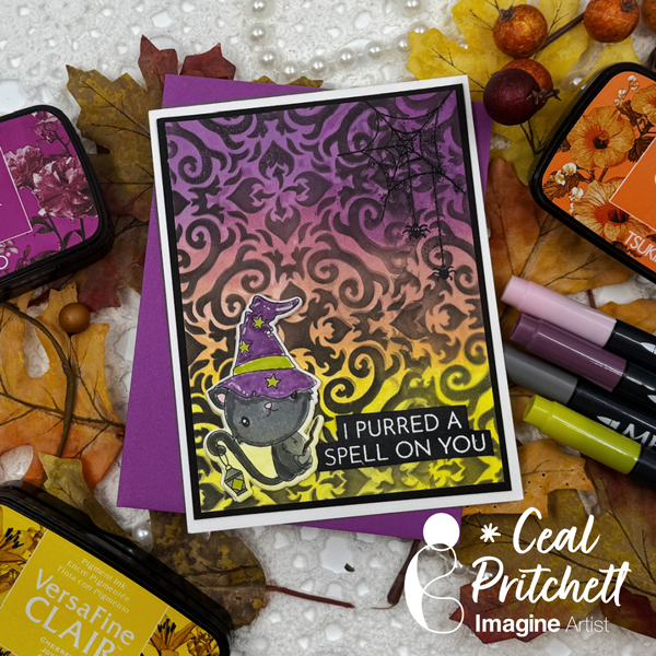
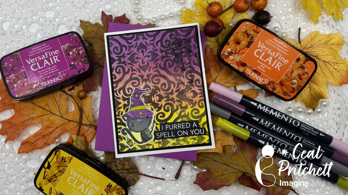
Hey there crafty friends! It’s Ceal, here. Today I am sharing a Halloween card with you.
Skill Level: Intermediate
Time: 30 Minutes
Directions:
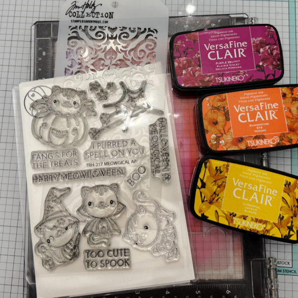
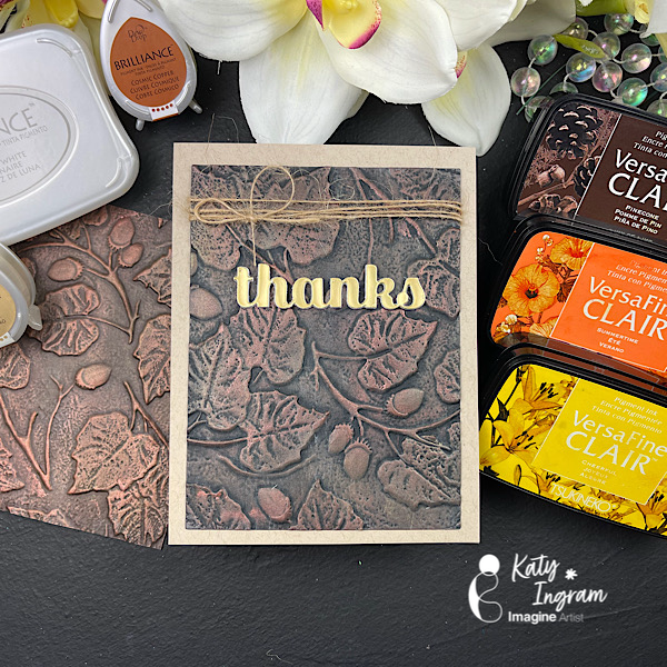
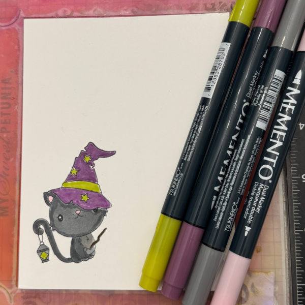
Gather your supplies. You will need a Halloween themed stamp set, a stencil, white and black embossing powder, some markers if you have a line art image and three Halloween colors of ink.
Step 1:
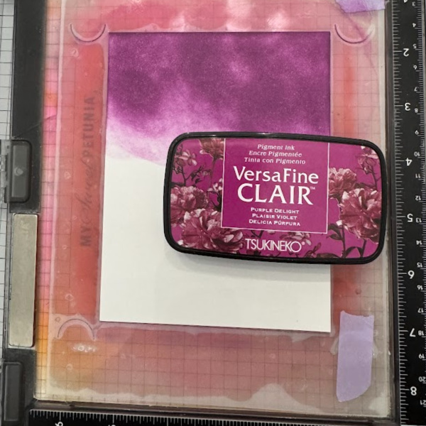
Ink Blend a purple ink (VersaFine Clair Purple Delight used) on a third of the panel.
Step 2:
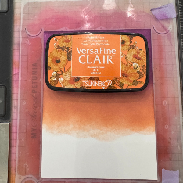
Ink Blend an orange (VersaFine Clair Summertime used) ink over the second third of the panel.
Step 3:
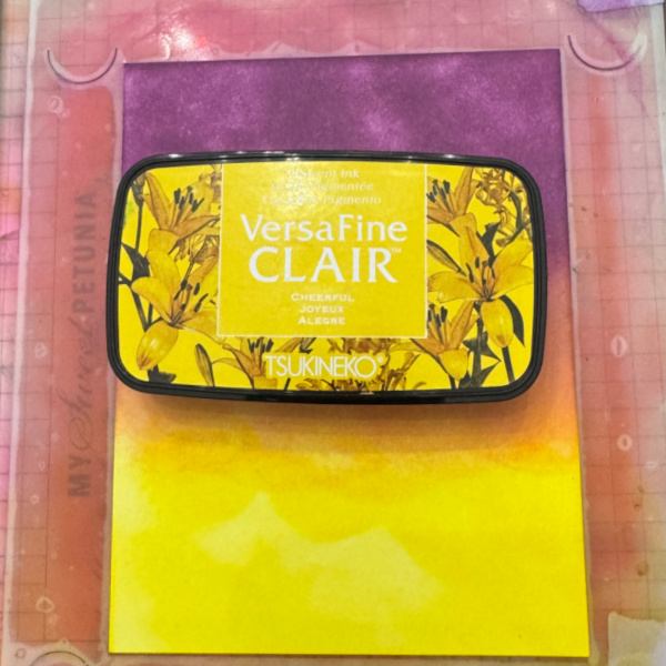
Ink Blend a yellow (VersaFine Clair Cheerful used) ink over the bottom third of the panel.
Step 4:
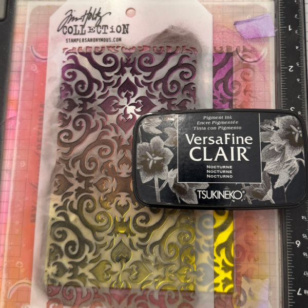
Place a stencil over the blended panel and add black (VersaFine Clair Nocturne used) ink over the stencil.
Step 5:
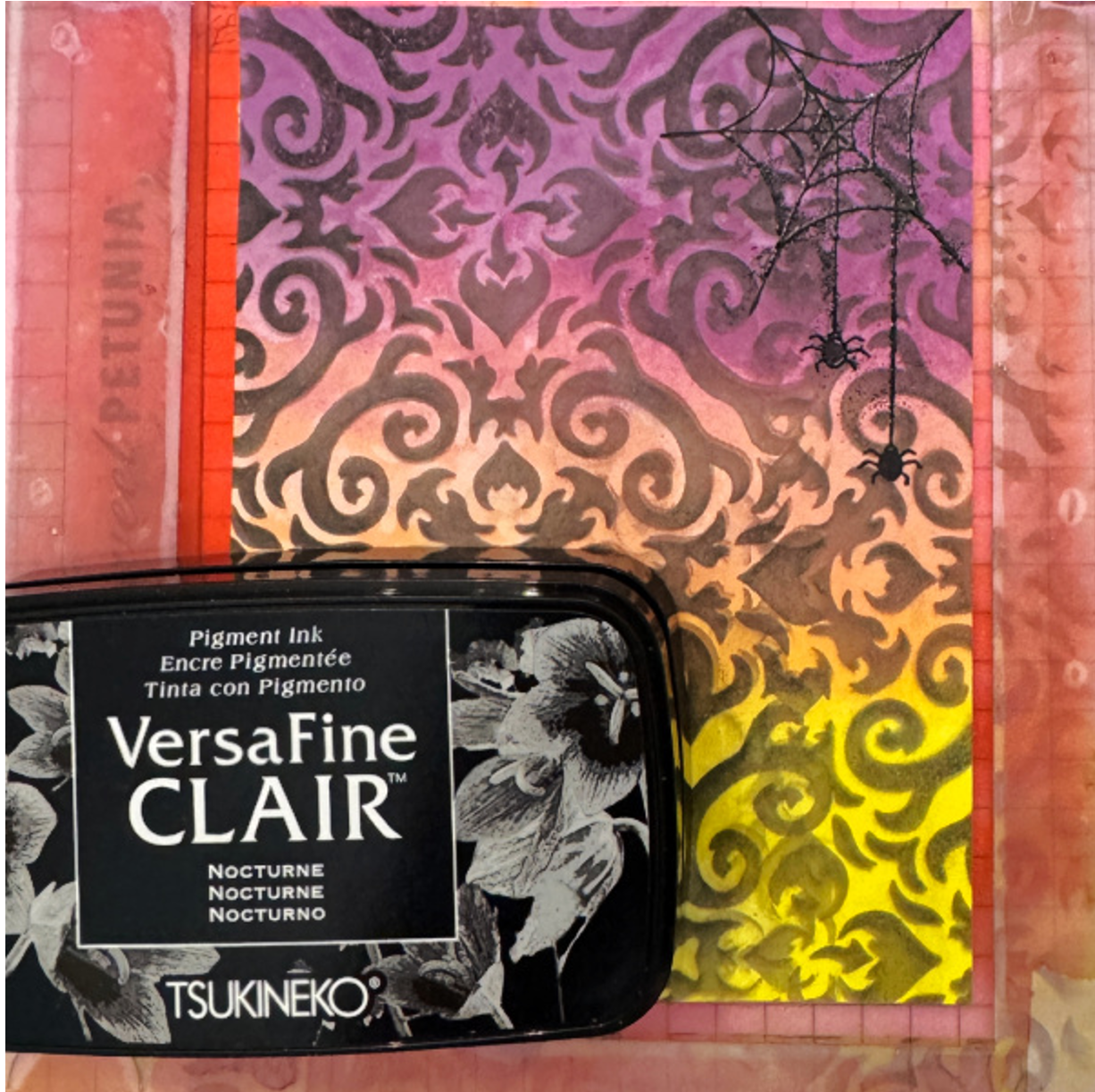
Stamp a spider web in the corner using black ink and then emboss with black powder.
Step 6:
Stamp, color and cut out the image and add to the front of the card.
Supplies:
Imagine Products
VersaFine Clair – Nocturne, Summertime, Cheerful and Purple Delight
Memento Markers – Angel Pink, Pear Tart, Sweet Plum and Gray Flannel
Other Products
Meowgical stamp set – The Rabbit Hole Designs
Meowgical Coordinating dies – The Rabbit Hole Designs
Stencil – Tim Holtz