By Alison Heikkila
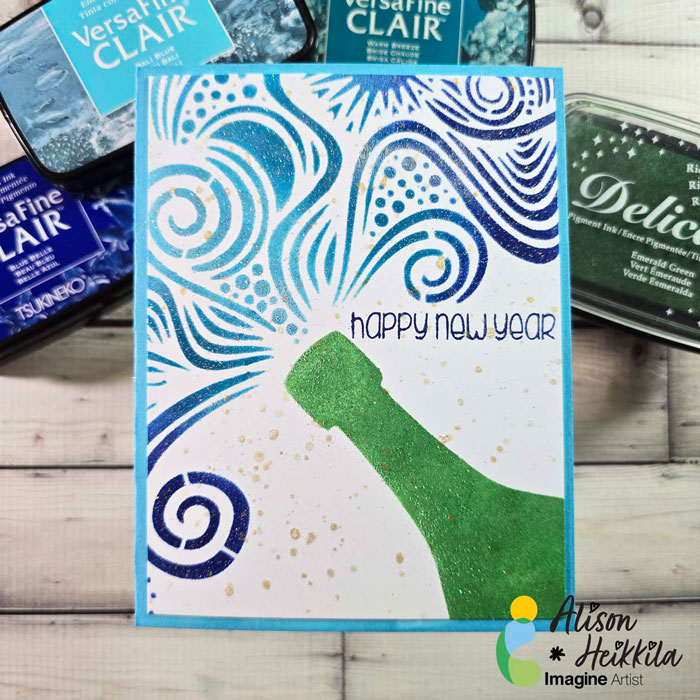
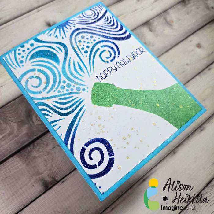
Hello! Alison Heikkila here. Do you make New Year’s cards? I like to make them when it’s too late to send out Christmas, Hanukkah, etc. cards. It takes off a bit of pressure, but still shows folks we’re thinking about them. I’ve got a quick and fun card that’s perfect not just for New Year’s, but for other celebrations too.
Skill Level: Beginner-Intermediate
Time to Complete: 15-20 Minutes
*Some affiliate links are used in this post. That means that if you shop through these links, I may receive a small compensation, at no cost to you.
Here is the YouTube video. If it doesn’t play properly, please click HERE.
Supplies:
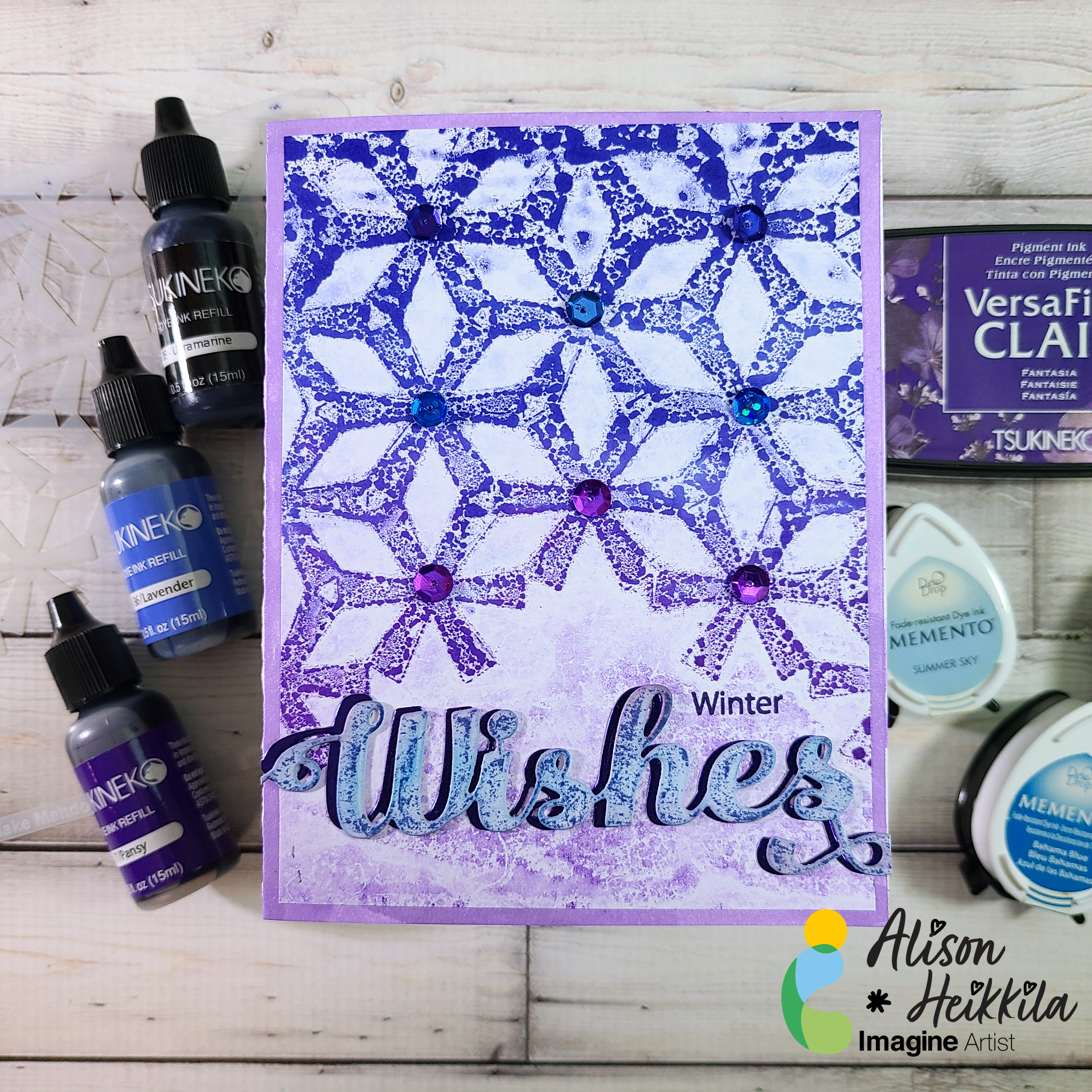
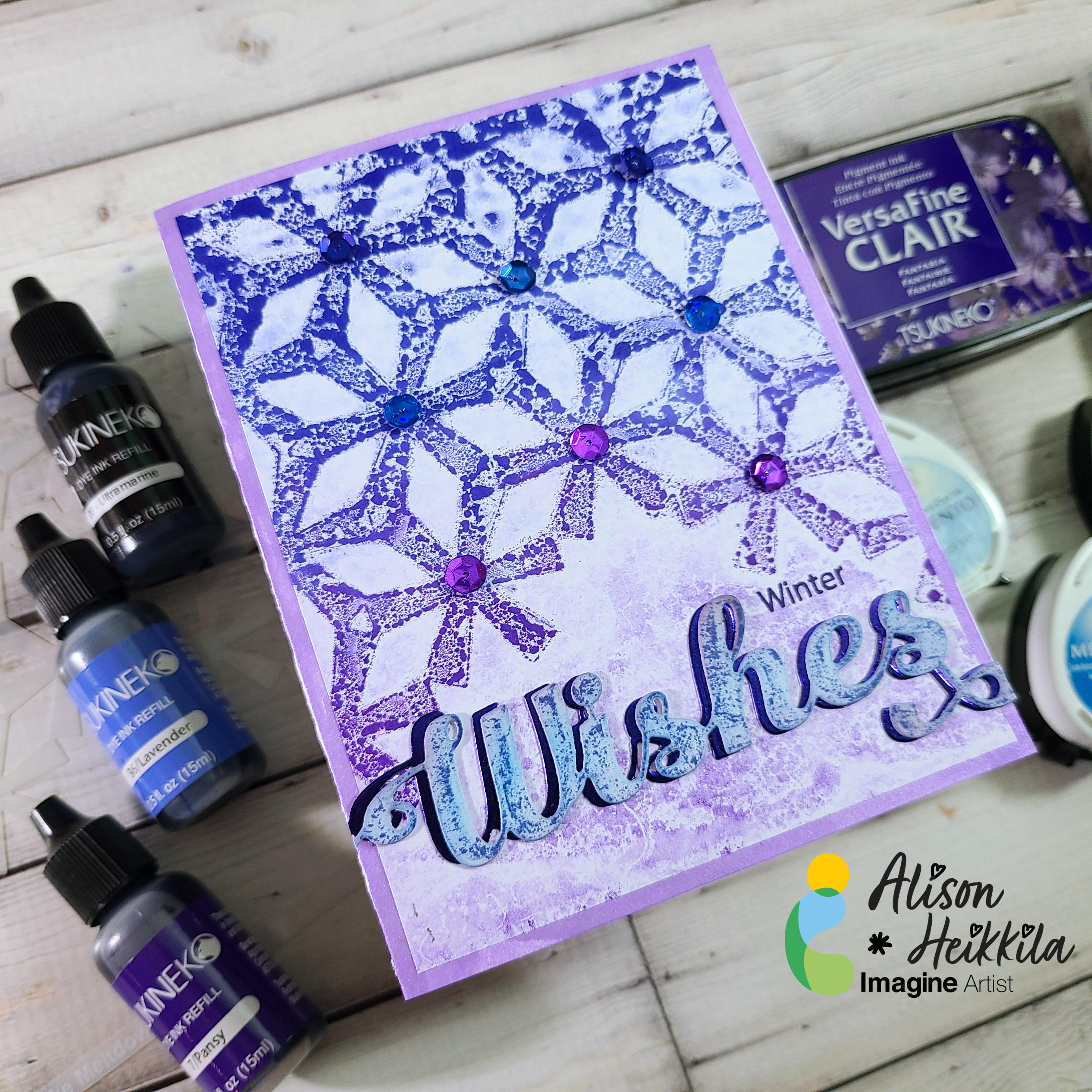
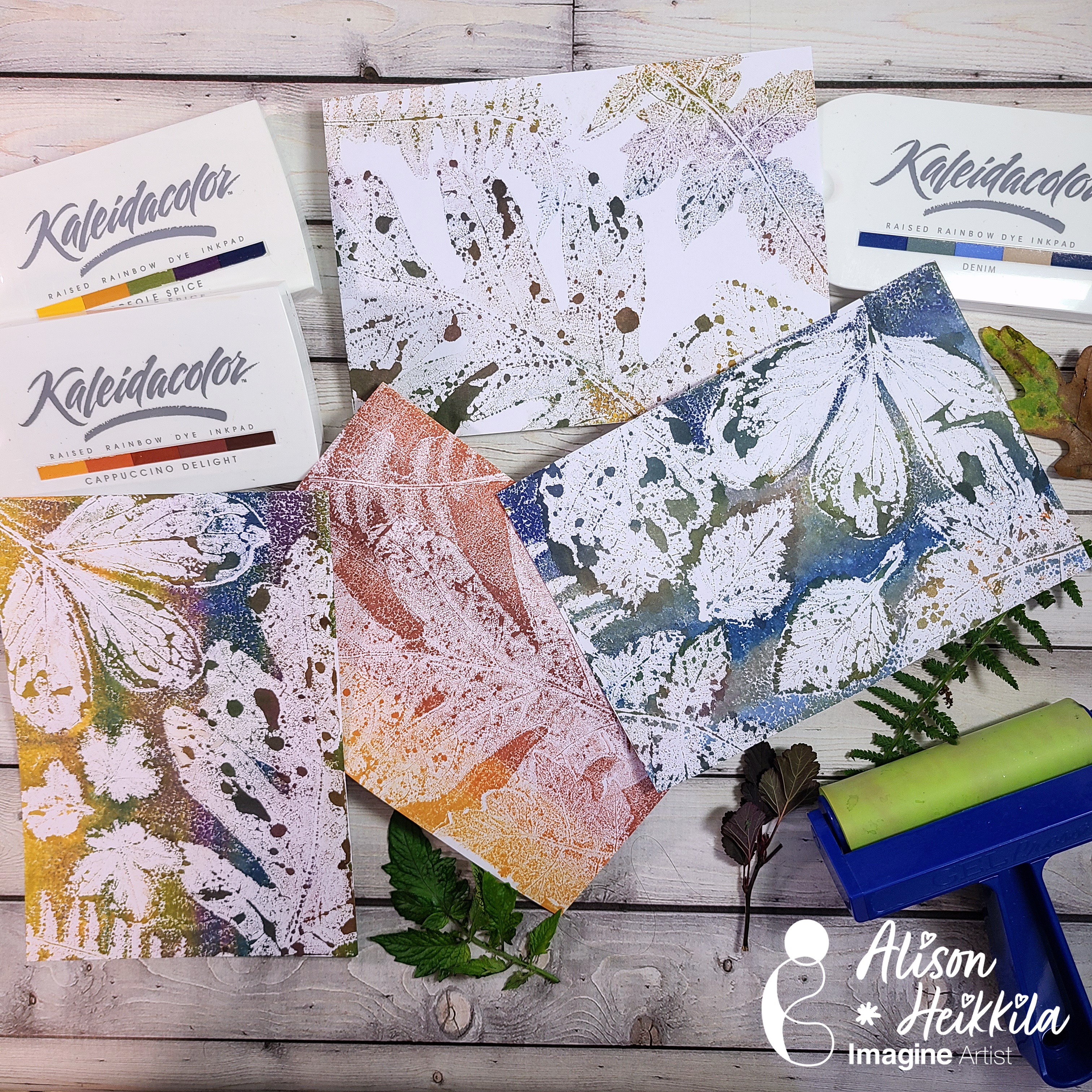
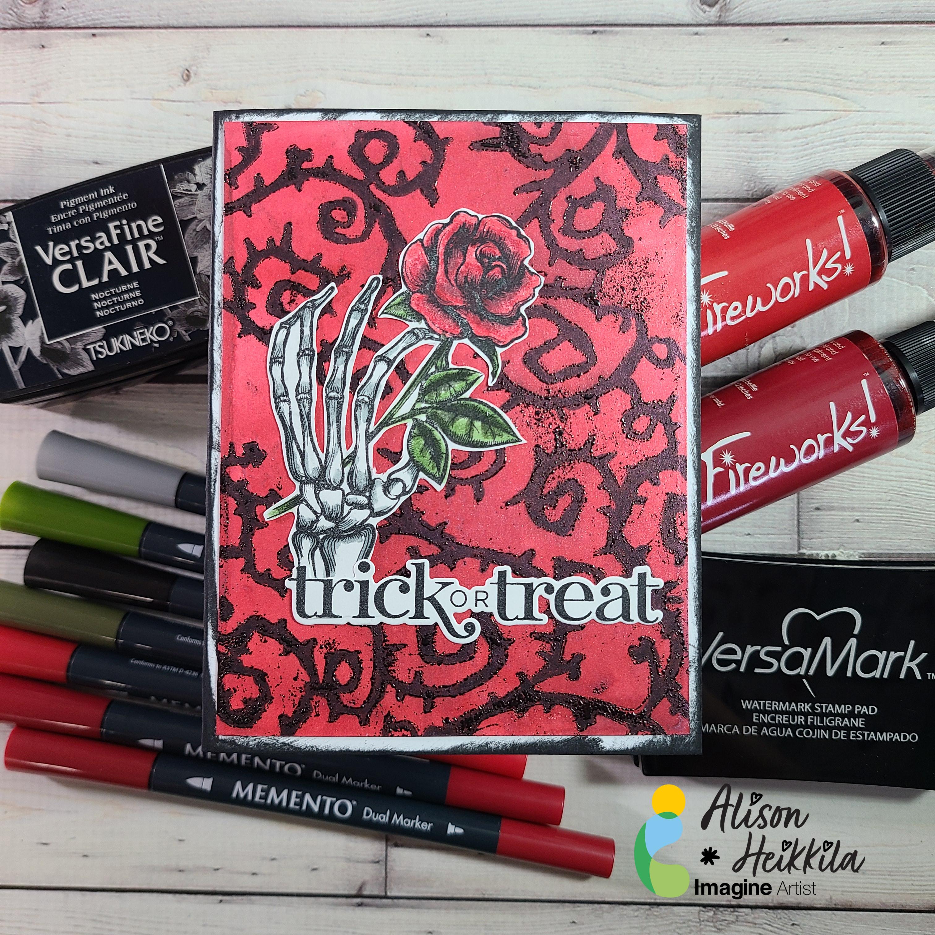
Imagine:
Emerald Green Delicata Ink
Bali Blue VersaFine Clair Ink
Warm Breeze VersaFine Clair Ink
Blue Belle VersaFine Clair Ink
Gold Sheer Shimmer Spritz
Sponge Daubers
Other:
A Colorful Life Designs: Pop the Cork Stencil
Clearly Besotted: Year of You (old version-no longer available)
Scrapbook.com: Artis Craft Glue
Stampendous: Star Dust Embossing Powder (discontinued)
Gel Press: 6×6 Plate
Cosmetic Sponges (optional)
I hope you’ll try blending with your VersaFine Clair Inks. And perhaps you’ll want to make some New Year’s cards too! Thanks for stopping by. Have an inspiring day!