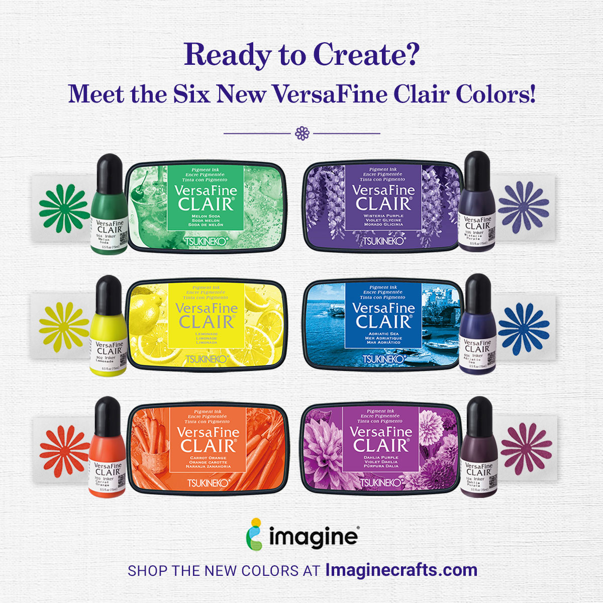
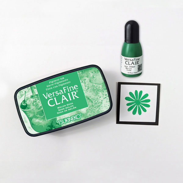
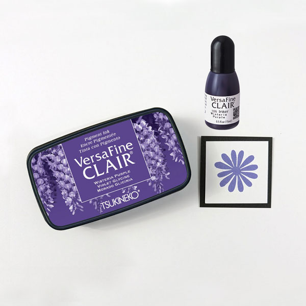
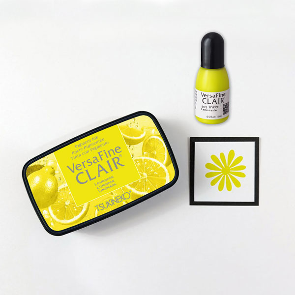
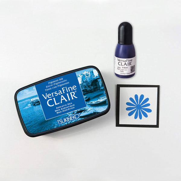
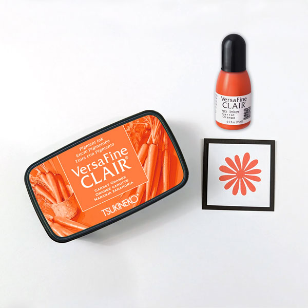
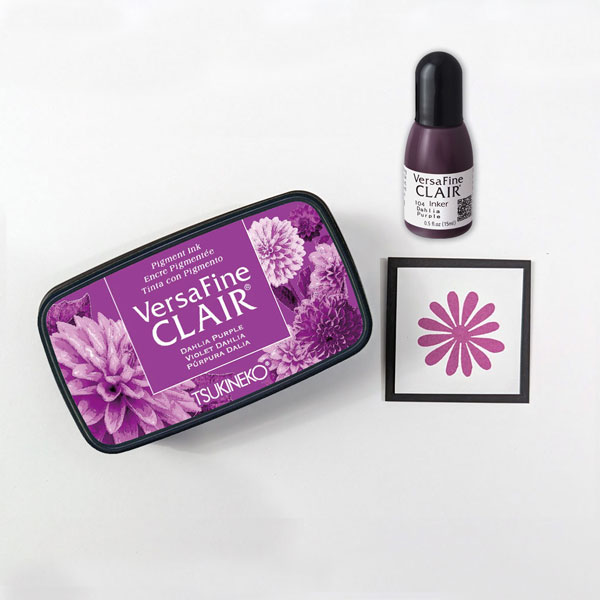
Whether you’re stamping detailed images, creating handmade cards, journaling, or experimenting with mixed media, the six newest VersaFine Clair colors are ready to inspire your next creation!
From vibrant citrus hues to rich florals and deep ocean blues, these beautiful additions expand the VersaFine Clair family with fresh, versatile shades you’ll reach for again and again.
Why Crafters Love VersaFine Clair
VersaFine Clair has become a favorite among stampers for a reason. Its richly pigmented formula creates crisp, detailed impressions that capture even the finest lines.
Perfect for card making, mixed media, journaling, and more, VersaFine Clair also:
Produces exceptionally detailed stamped images
Dries quickly, making it ideal for heat embossing
Becomes water resistant when dry
Works beautifully on a variety of papers
Features an airtight case that helps keep your ink pad fresh longer
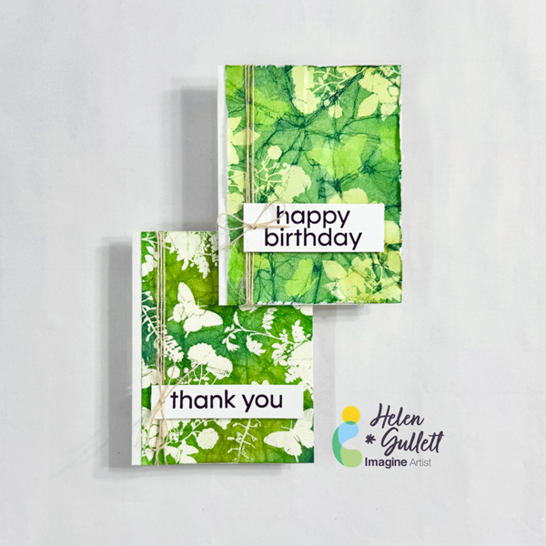
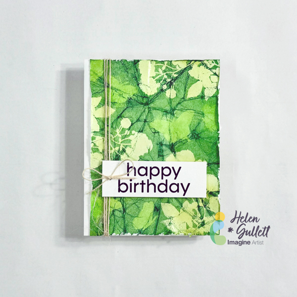
Hello crafty friends! One of my favorite cardmaking techniques is heat-embossing resist. Today, I want to share with you how to make these Batik cards using this technique. It is a technique you can use to create fun and colorful backgrounds with heat embossing and ink blending.
Let’s get crafting!
Skill: Beginner Time: 20 minutes
Direction:
Step 1 Cut out a piece of 8.5 inch x 11 inch white cardstock into 4 panels of 4.25 inch x 5.5 inch.
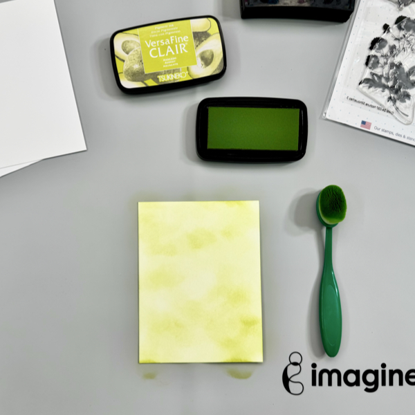
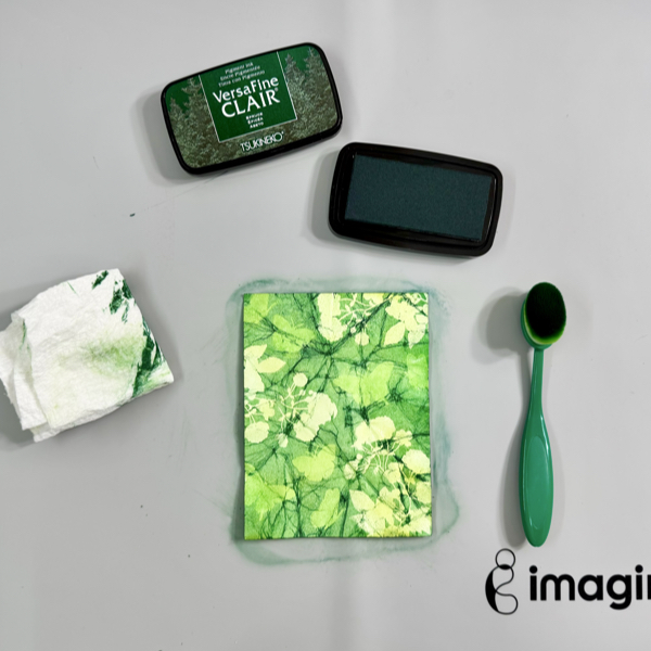
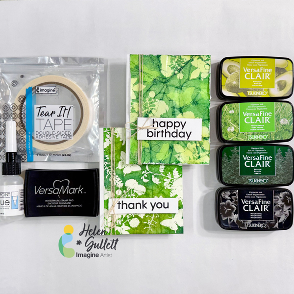
Using a blending brush, add some of the VersaFine Clair Avocado ink to one of the white cardstock panels.
Dry the ink on the cardstock with a craft heat gun.
Step 2 Add some of the anti-static powder all over the inked panel.
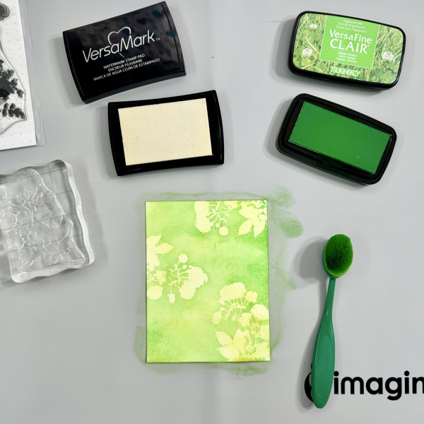
Stamp the images with VersaMark ink and add some of the clear embossing powder. Heat the embossing powder with a craft heat gun.
Using a blending brush, add some of the VersaFine Clair Grass Green ink on the panel.
Carefully dry the ink on it, not to make the embossed images melt too much. Let it cool down before touching it. Gently wipe off the extra ink with paper towel.
Step 3 Add again the anti-static powder on the panel.
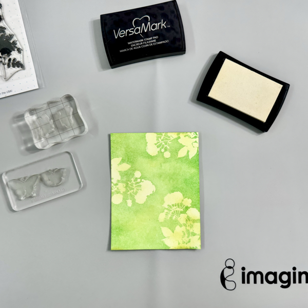
Stamp the next images with VersaMark ink and add some of the clear embossing powder. Heat the embossing powder with a craft heat gun.
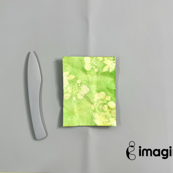
Step 4 After heating up the embossing powder, crumble the cardstock. Depending on the cardstock you use, you can spray the back of the cardstock lightly with water and then crumble it.
Flat it back on the craft mat and use the bone folder to smooth it down. You won’t get perfectly smooth cardstock back but the crumble lines are the one that will give the texture that we need for the batik look.
Step 5 The next step is adding more color to the panel!
Use the blending brush, add some of the VersaFine Clair Spruce ink on the panel.
You will start to see the pattern. Add more ink if needed to get more contrast between 3 colors.
Use a paper towel to wipe off the extra ink off the embossed images.
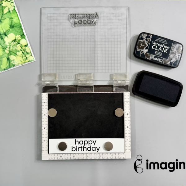
Step 6 On a piece of white cardstock, stamp the sentiment with VersaFine Clair Nocturne ink.
Dry the inked sentiment with a craft heat gun.
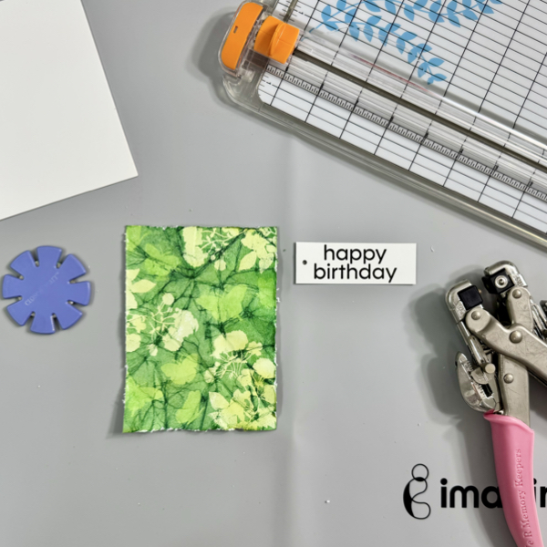
Step 7 Use a paper trimmer to trim the sentiment into a label size and punch a hole on one of the side.
Use a paper distress tool or a knife to distress all the edges of the background panel.
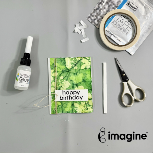
Step 8 Add the background panel on the card base using On Point Glue.
Wrap around some of the burlap twine on the card, before tie it up, add the sentiment label on the card. Put the tail of the burlap twine through the label hole. Glue the sentiment on the card with some white foam and Tear It! Tape.
Tie up the burlap twine into a bow.
This Batik cardmaking technique works well with solid images because of the heat embossing resist effect. You can pick any 2-3 colors of inks you can use that compliment each other.
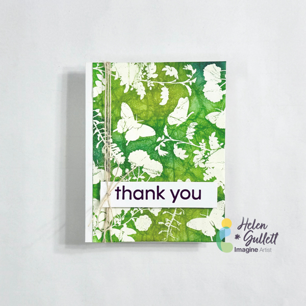
Here’s the different look of the Batik card I made using the same heat embossing technique but simpler. So, instead of multiple times heat-embossing the images and blending the inks, this one is only once. Here’s the simpler steps:
First, heat emboss the image directly to the white cardstock panel.
Second, crumble the cardstock, flat it out back using a bone folder.
Third, using blending brush add the ink on the cardstock starting with the light color, medium color, then dark color.
I hope you will give this Batik technique a try and play around with different colors. Thanks so much for stopping by our blog today.
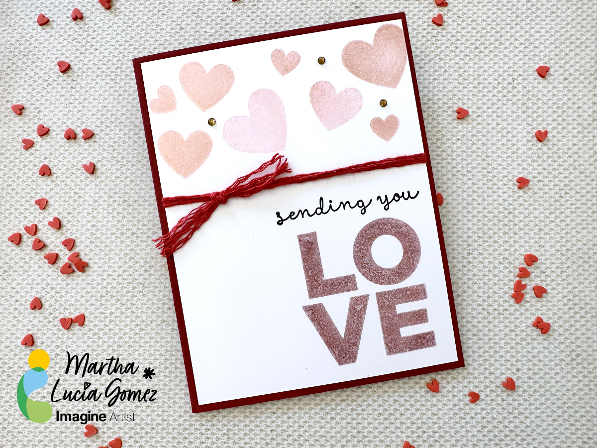
Hello there! Today’s tutorial is about texture without dimensions. Do you know that you can create a flat card with these two ingredients and just one type of ink? Well, the Delicata is the ink that can bring you these possibilities and more. I decided to make this card using two colors of Delicata, Ruby Red and Rose Gold.
Skill: Beginning
Time: 45 minutes
Directions:
Step 1:
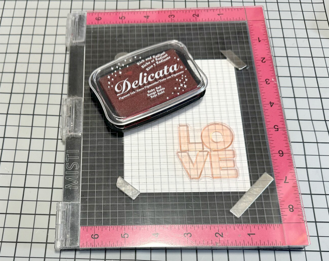
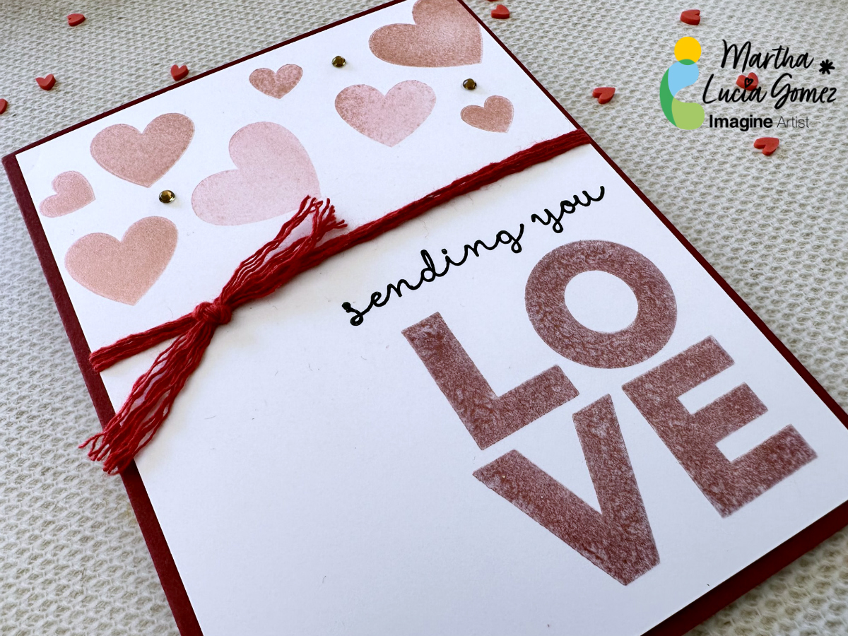
Take a piece of white smooth cardstock and solid stamps to create your design. In my sample, I am using hearts in different sizes and the Love Sentiment. First, ink the sentiment using the Ruby Red Delicata Ink. The Delicata is a pigment ink that dries within minutes on porous papers and never loses the luster. You can also obtain a Metallic touch with it if you don’t emboss the stamped images.
Step 2:
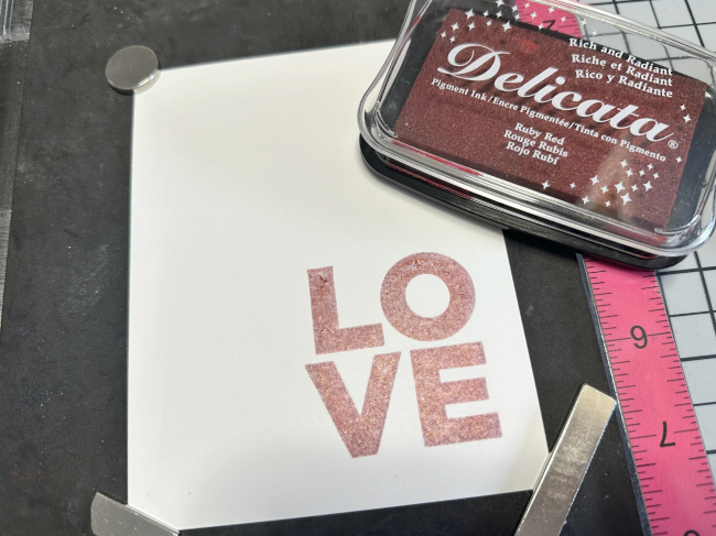
If you want to obtain more texture and coverage, you can stamp the same image several times. In my sample, I stamped it three times.
Step 3:
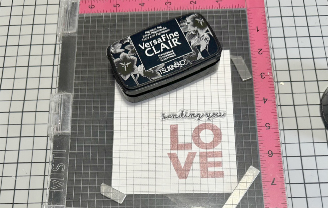
To complete the sentiment, you can stamp a complement using the same ink or other ink. On this sample, I used VersaFine Clair Nocturne. On it, you can notice the different textures of both inks and the soft color of the Delicata.
Step 4:
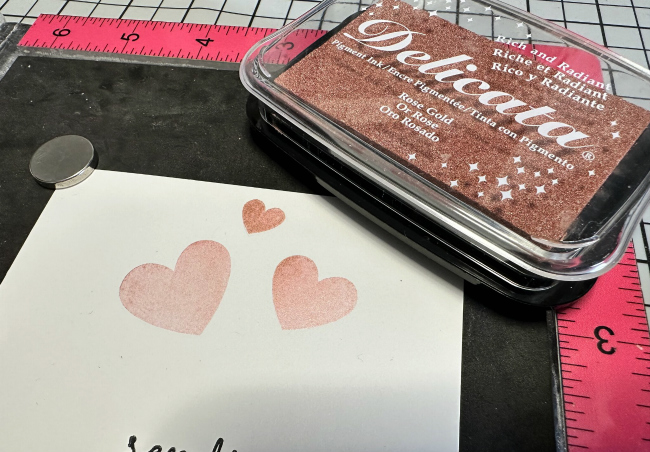
Now is the time to create more texture. This time, I used Rose Gold Delicata Ink to create it and hearts in different sizes. I stamped them randomly on the upper part of the card. Using a stamping tool, you can create different tones with the same ink and color, depending of the times that you stamp your image.
Step 5:
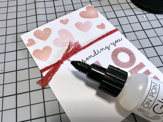
After finalizing the stamping process, I decided to embellish the card with a few loops of red twine. I used a dot of On Point Glue to secure just the knot.
Step 6:
Due to the dimension created with the twine, I pasted the decorated layer over a red card base using crafty foam tape. And voila, my soft and textured Valentine’s Card is ready!
Thanks for stopping by and don’t forget that you can explore more textures with other colors of Delicata Ink.
Hello! Kathy here, creating art for Imagine Crafts! Today’s project is a treat/gift card holder for Valentine’s Day but it is also about ADHESIVES! Adhesives aren’t the focus on most tutorials so let’s change that today.
.Skill Level: Easy
Time to complete: 1 Hour
Directions:
Step 1
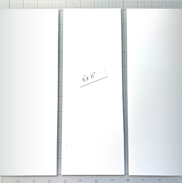
Cut 3 pieces of a layering weight, white card stock to 4” x 11”. This will be enough for three holders. You don’t need a heavy weight card stock as we will be scoring, folding and adding a layer of patterned paper.
Step 2
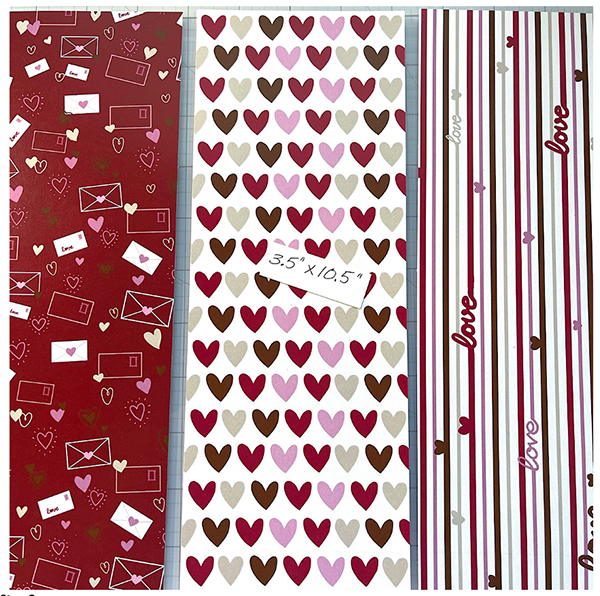
Cut 3 panels of patterned paper to 3.5” x 10.5”. I had this fabulous patterned paper from Kat Scrappiness in my stash which is perfect for Valentine’s Day!
Step 3
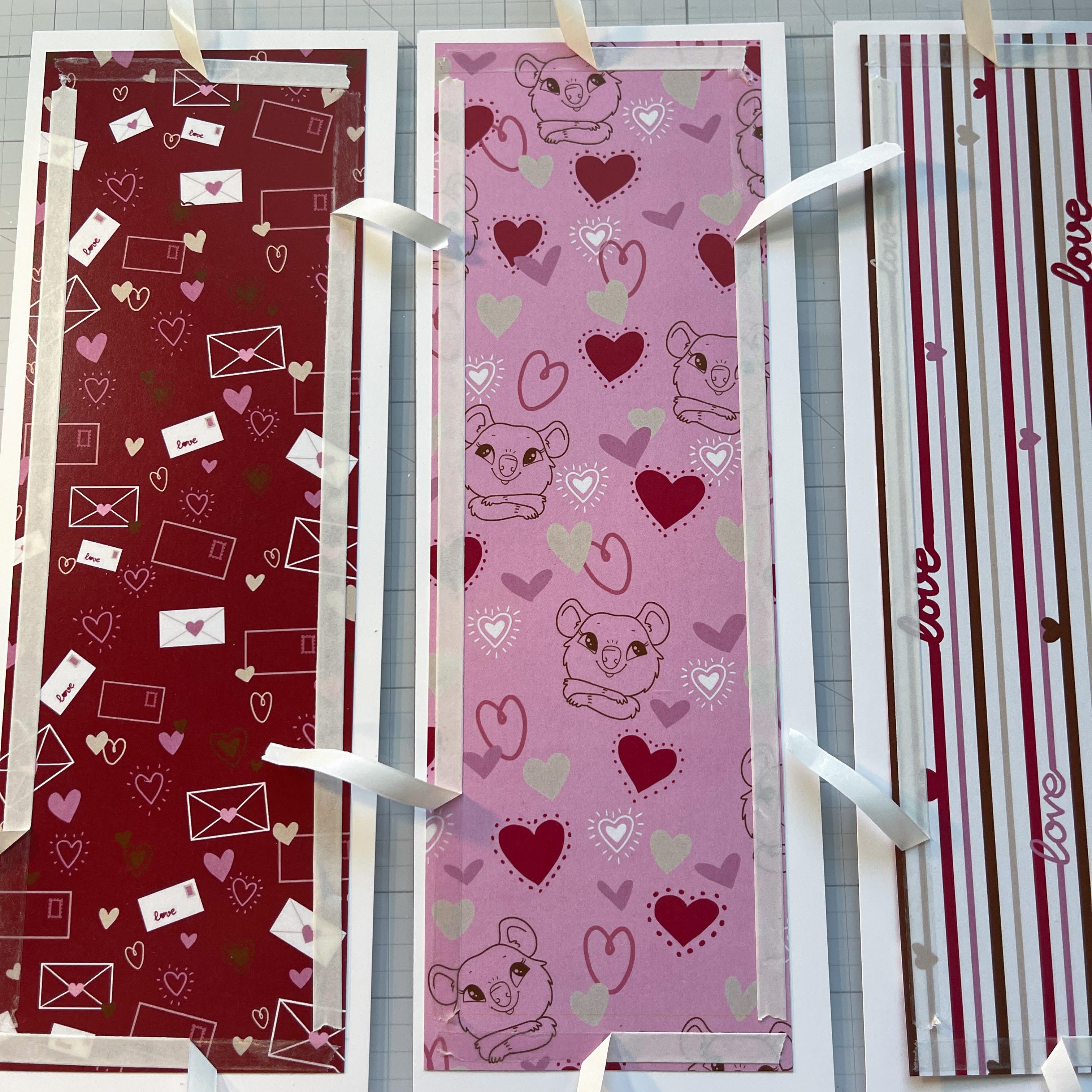
Here is where the adhesive comes in! You will attach the patterned paper panels to the white card stock. The Tear It! Tape from Imagine Crafts is SO easy to use. It is a strong double-sided adhesive AND you don’t need to reach for your scissors every time you want a piece. Just tear it! It tears so easy! We will also be using the On Point Glue and I will give you a tip in a second. The On Point Glue comes in a small bottle with a micro tip. The cap of the bottle has a built in pin that fits in the micro tip when you close the cap so it never gets clogged! No more losing those pins!
Step 4
Add your Tear It! Tape to the back of all four panels on all sides. Here’s a tip, pull up only a bit of each back and a bit of On Point Glue to the exposed area. Then flip the panel over and align to your white card panel. This allows some wiggle room for you to align the panels perfectly! Once the patterned panel is aligned press down the areas of exposed adhesive and then gently pull the backing paper off from each side.
Step 5
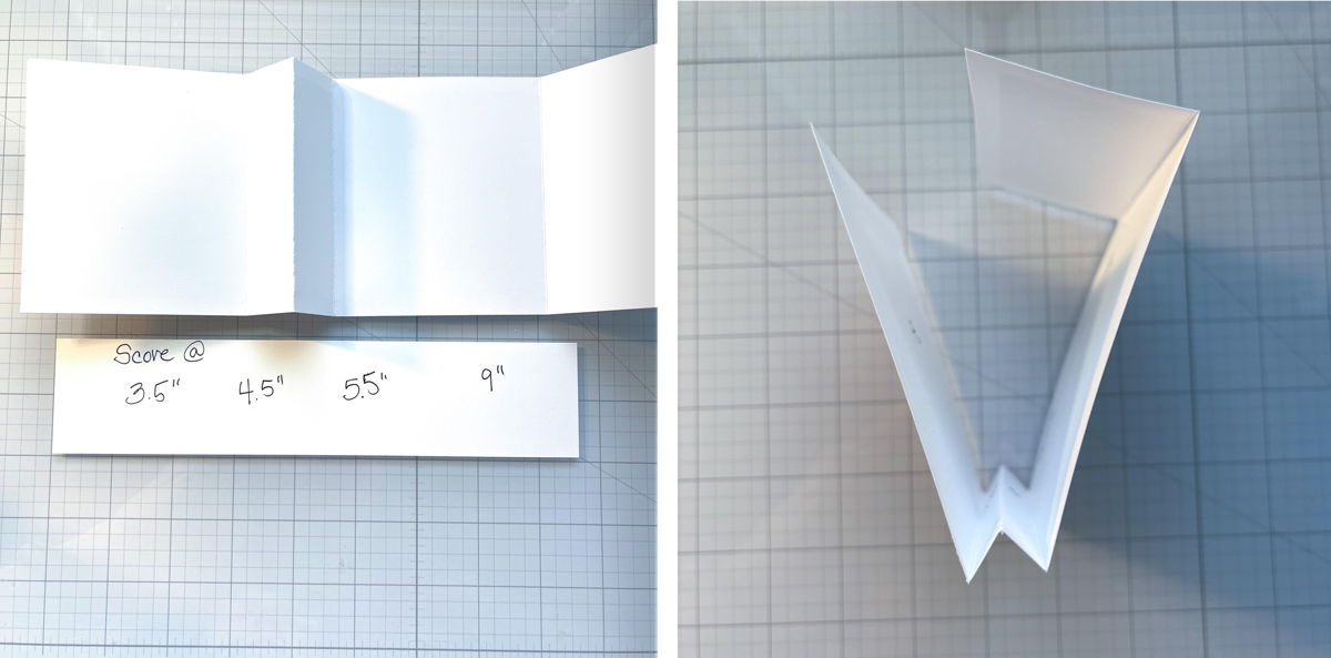
Now it’s time to score and fold. You will score as indicated above and fold in the manner shown.
Step 6
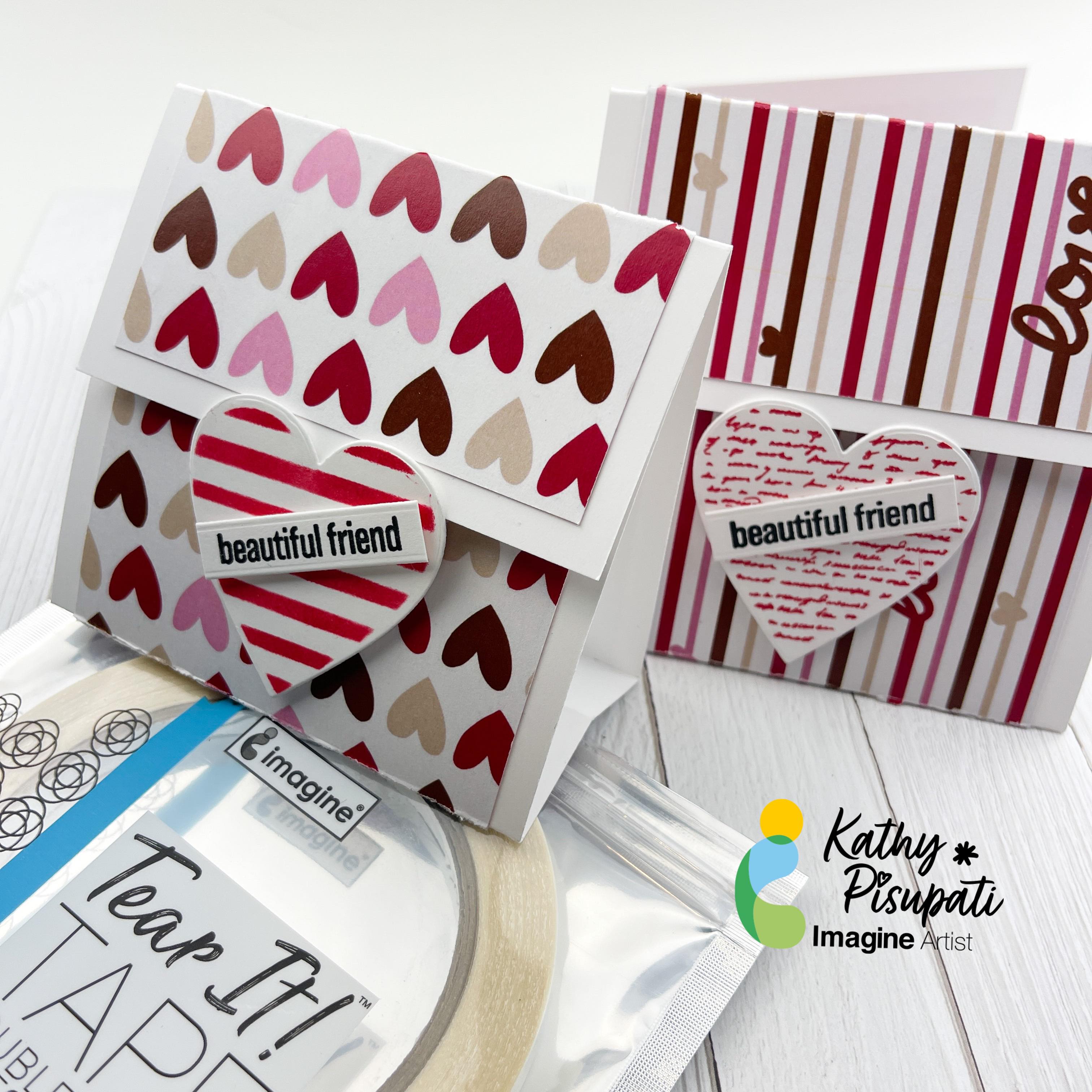
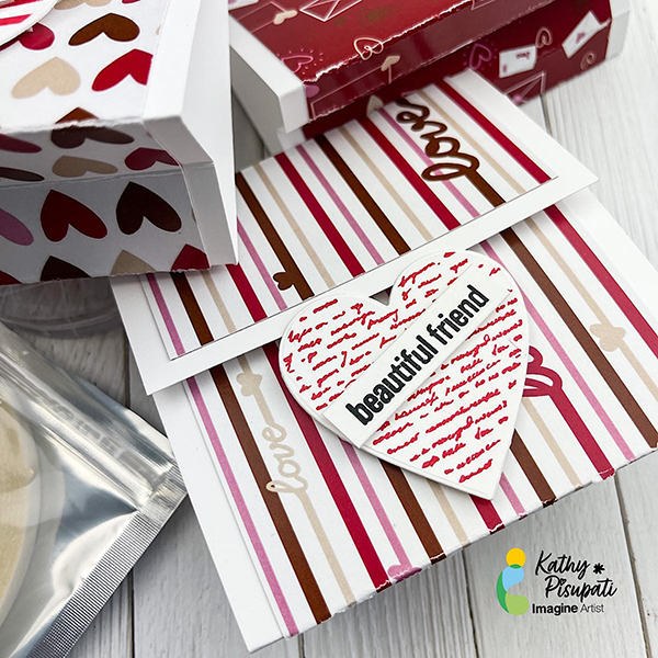
Now it’s time to add a little decoration! I used a heart die and coordinating stamps. I stamped using VersaColor Cardinal ink. For the sentiment I used VersaFine Clair Nocturne Ink. Foam tape was added to the lower half of the heart. The reason for this is so the flap of the holder can tuck under the heart. I also added foam tape to the sentiment, adding a bit more dimension to the design. These were SO easy to create and you could change up the design for ANY occasion. I haven’t put anything inside yet. A gift card fit perfectly inside, just add some temporary adhesive to the back of the gift card. You can also adhere a small cellophane bag filled with small treats and adhere it or add a bit of temporary adhesive to the back of a fun-size candy bar! Perfect for Valentine’s Day and Halloween!
I hope you enjoy this card and the tutorial. Thanks for stopping by I appreciate all of you! Please head over to the Imagine Crafts website to see all the beautiful products. Here is the link IMAGINE CRAFTS.
In today’s tutorial you will learn to create a super easy wood sign using the ever versatile VersaFine Clair inks. The VersaFine Clair worked beautifully for this project that took just under and hour from design concept to completion! The ink pads are nice and juicy, so the first stamp image was perfect every time, which is helpful when free hand stamping with out a stamp platform.
Skill: Beginner
Time: 1 Hour
Directions:
Step 1:
Remove twine from the sign so it will lay flat on your work surface. With lines on the sign already in place it was easy to line up the sentiment and acrylic stamp block. Once the stamps are aligned, place a large acrylic block over the stamps lining up the edges to allow perfect positioning.
Step 2:
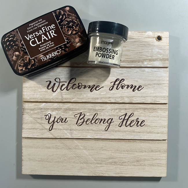
Stamp the sentiment in VersaFine Clair Pinecone and heat emboss with clear Embossing Powder. Gives the sentiment a bit of shine and keeps it from smearing!
Step 3:
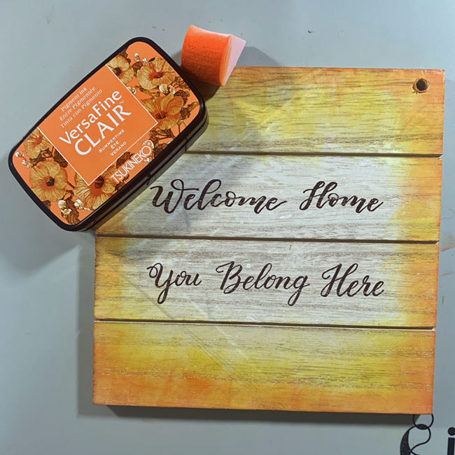
Using and ink blusher ink the edges of the sign with VersaFine Clair Cheerful. Start from the outside edge and blend toward the center to create a slight ombre look.
Step 4:
Using and ink blusher ink the edges of the sign with VersaFine Clair Summertime. Start from the outside edge and blend toward the center but not as far as the Cheerful layer.
Step 5:
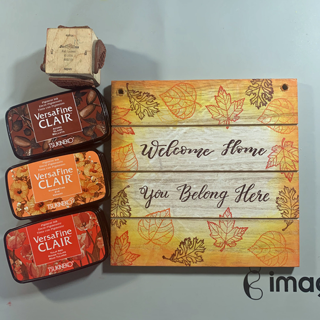
The leaf images are stamped using a very old stamp that features Fall leaves. The Oak leaf is stamped in VersaFine Clair Acorn, the Aspen leaf in Summertime, and the Maple leaf in Tulip Red. The sign can be heated with a heat gun, or set aside until the ink dries.
Step 6:
Replace twine through holes in the sign and display!
Hello Friends! Katy here and I am excited to share my project with you today. I am using the Kaleidacolor Ink Pad in Caribbean Sea to create my two plaid panels. Have you ever wondered or struggled with what colors to use to create a plaid background? Well my friends wonder and struggle no more because the Kaleidacolor Ink Pads solve it all. These ink pads coordinate so well that it takes the guesswork out. In the video I show just how easy it is, with a stencil of course, but the best part is, you don’t have to use all the colors or all the layers of the stencil I am using to get some really cool backgrounds. I will definitely be bringing the pads out more often to take the guesswork out of what colors go well with each other. Thanks so much for stopping by.